Runestone scroll – May 2019

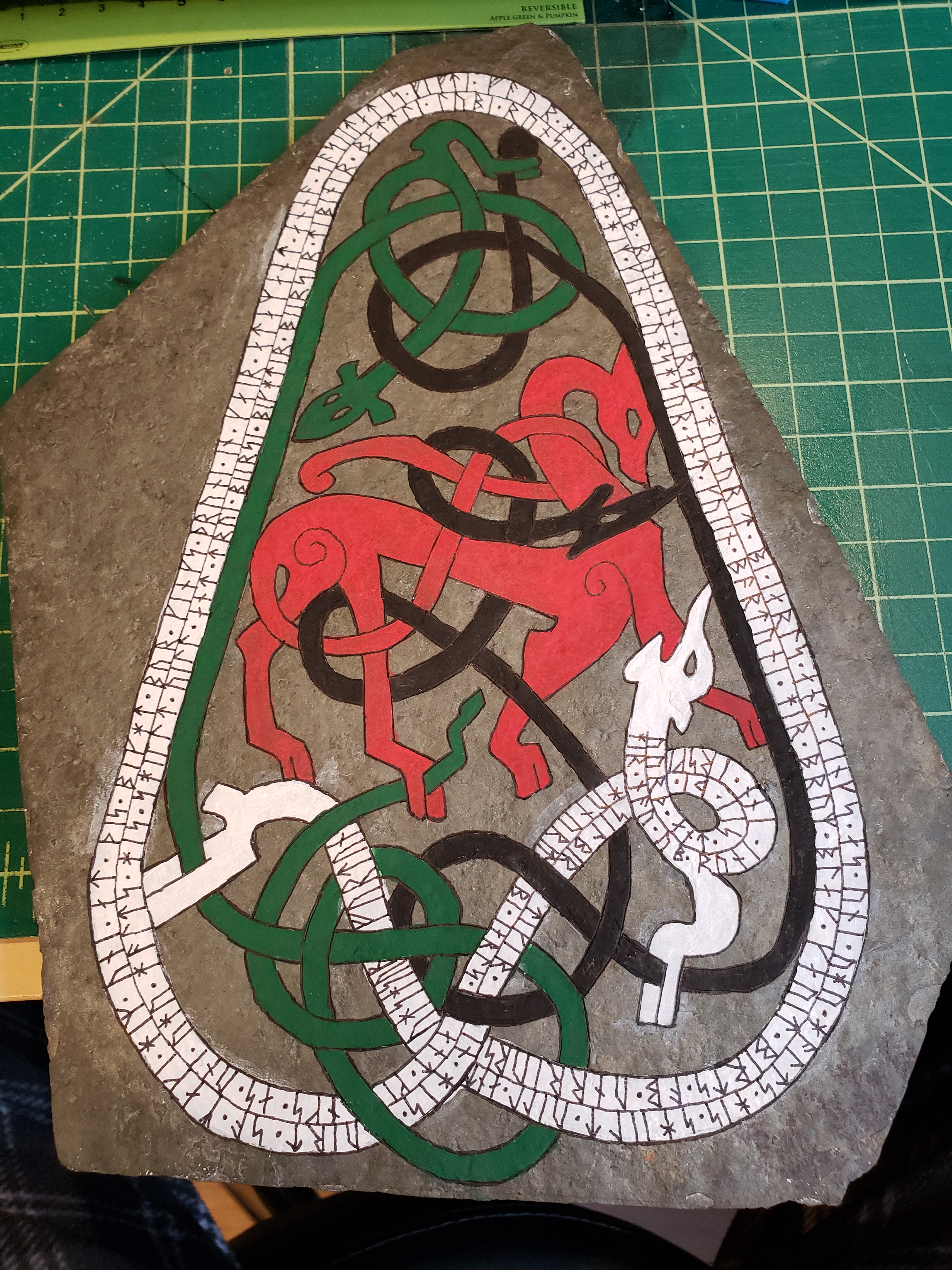
This is my first runestone that was based off the Uppland Sweden standing runestones. It’s based off of one that I can’t find online, but is in the Dover press ‘Viking Designs’ book, and I can find the rest of the ones on the page, so I’m assuming it’s just not digitized yet. If it does not actually exist, it’s at least very much in keeping with the style, so I feel it’s ‘close enough’.

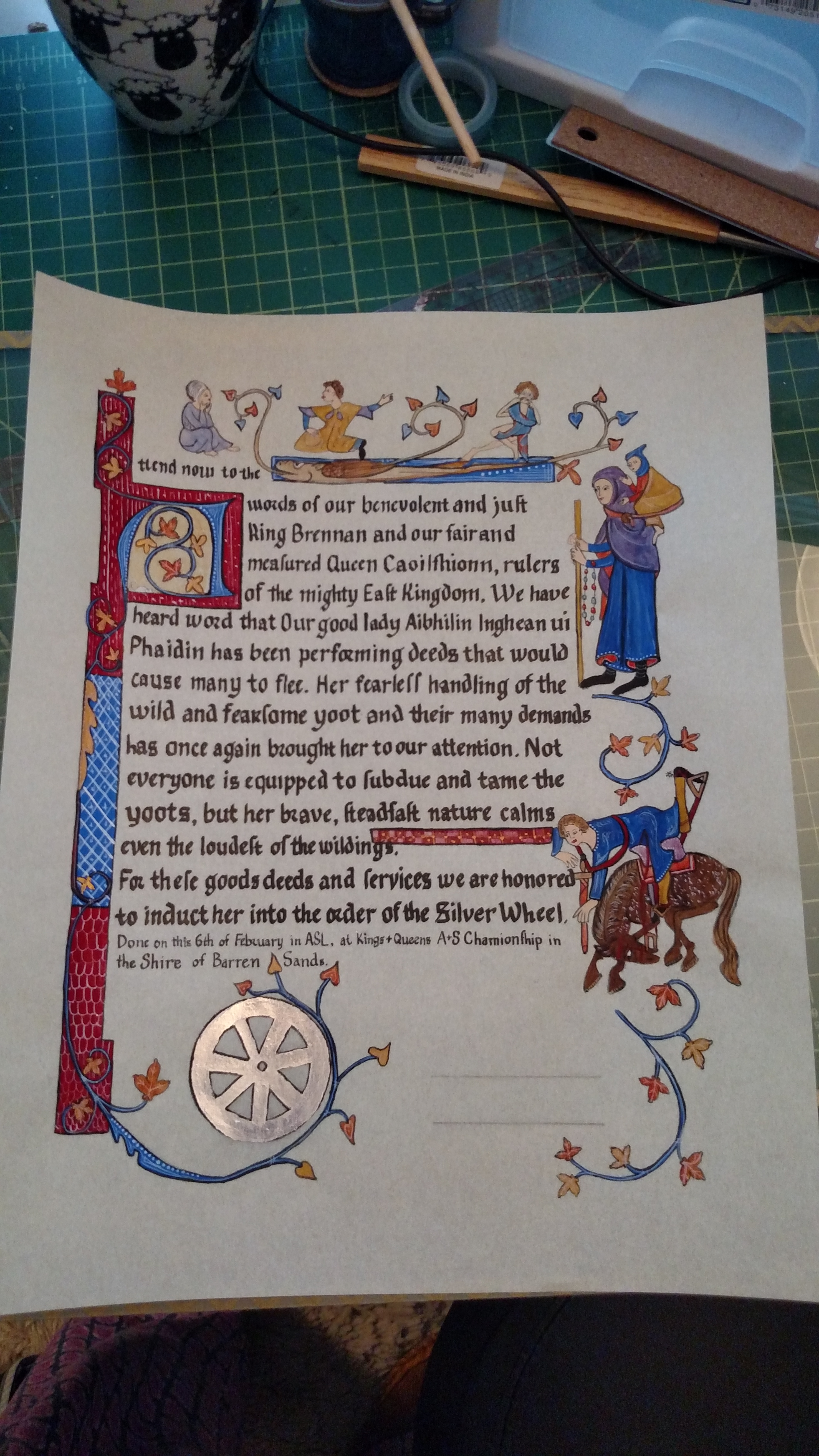
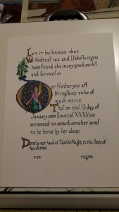
Here’s the finished scroll –

Now to tell the story…

The award write up I received, told of a brave viking warrior who has joined our society in the last year or so, and has made every effort to better himself in the art of war. It was suggested that he would enjoy a scroll with runes on it, which immediately my mind went to carving him a stone.

I passed the award recommendation to fellow Silver Brooch Sisuile Butler who had told me a few weeks earlier that she loved writing words. (Music to the ears of most scribes!) While she worked on the words, I got to work on the stone.

I had planned to raid the stash of flagstones that Leanne and I had bought a few years ago for such projects, but due to scheduling and such, it was easier to just go get another batch of them from Home Depot. (Plus, now I have my own stash, just what my scribal closet needed…) So one of the many rainy days of April, I went over to the local Home Depot and grabbed two bags of soaking wet stones. Had the weather or light been better, I’d have picked out the perfect set, but given the conditions, I went with two sets and hoped for the best. Once home I set out all the stones I had acquired and found one that would stand up on one side and look about right for the job.

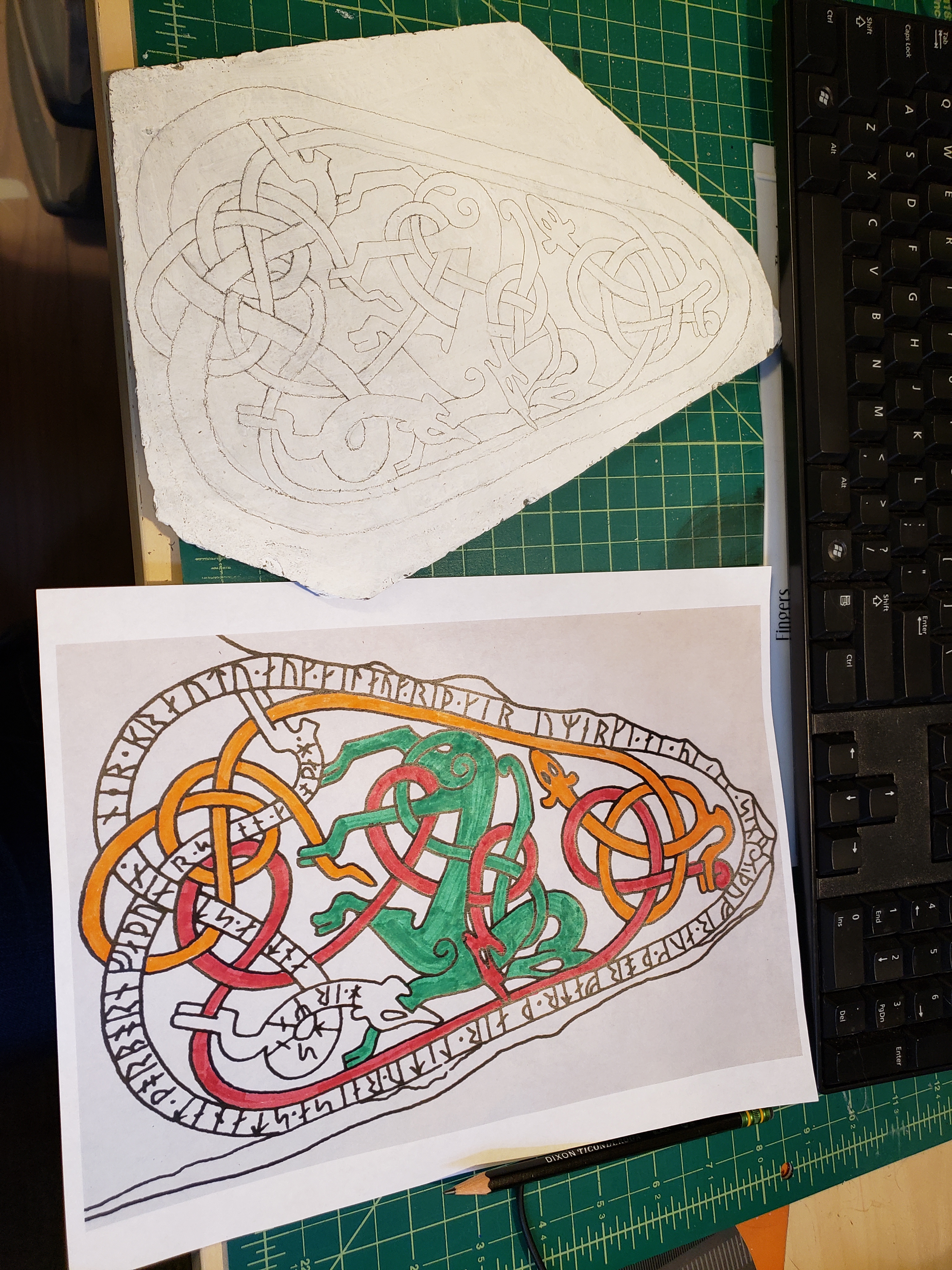
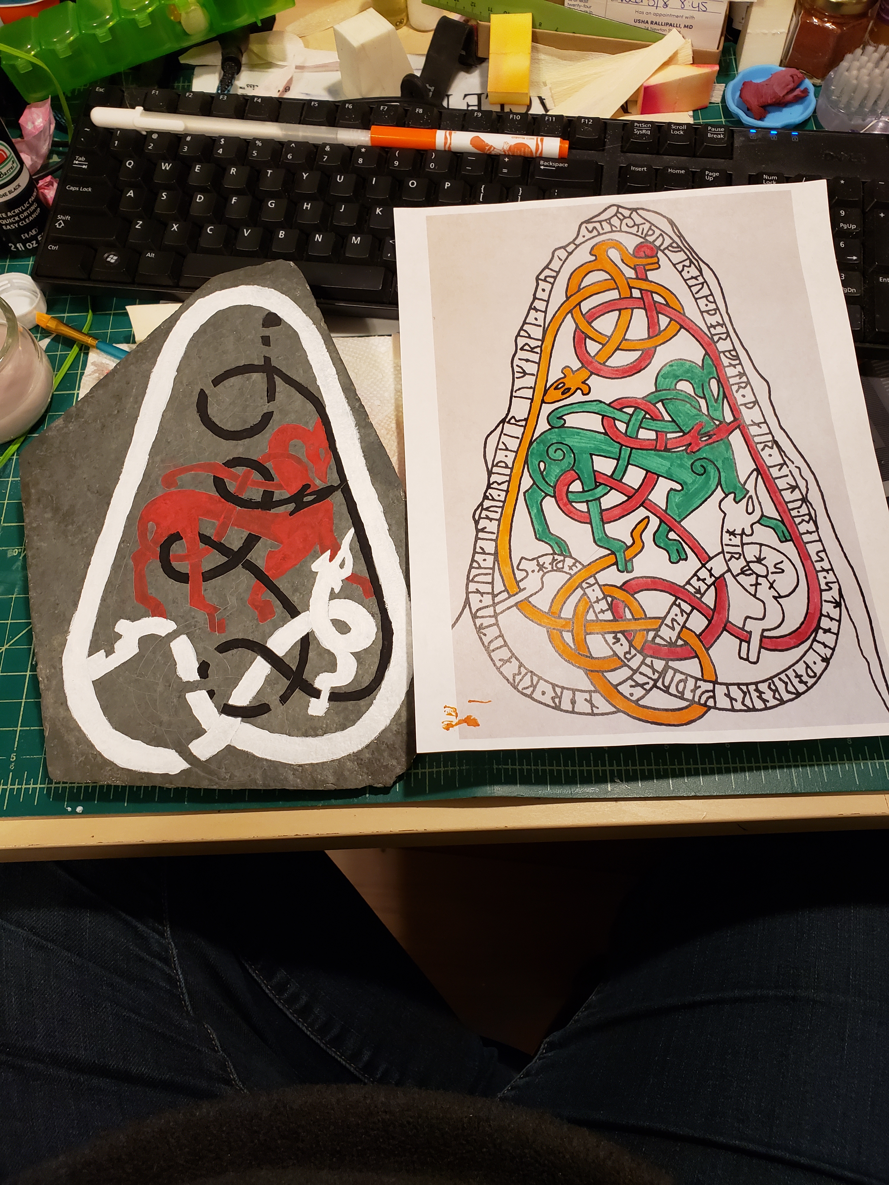
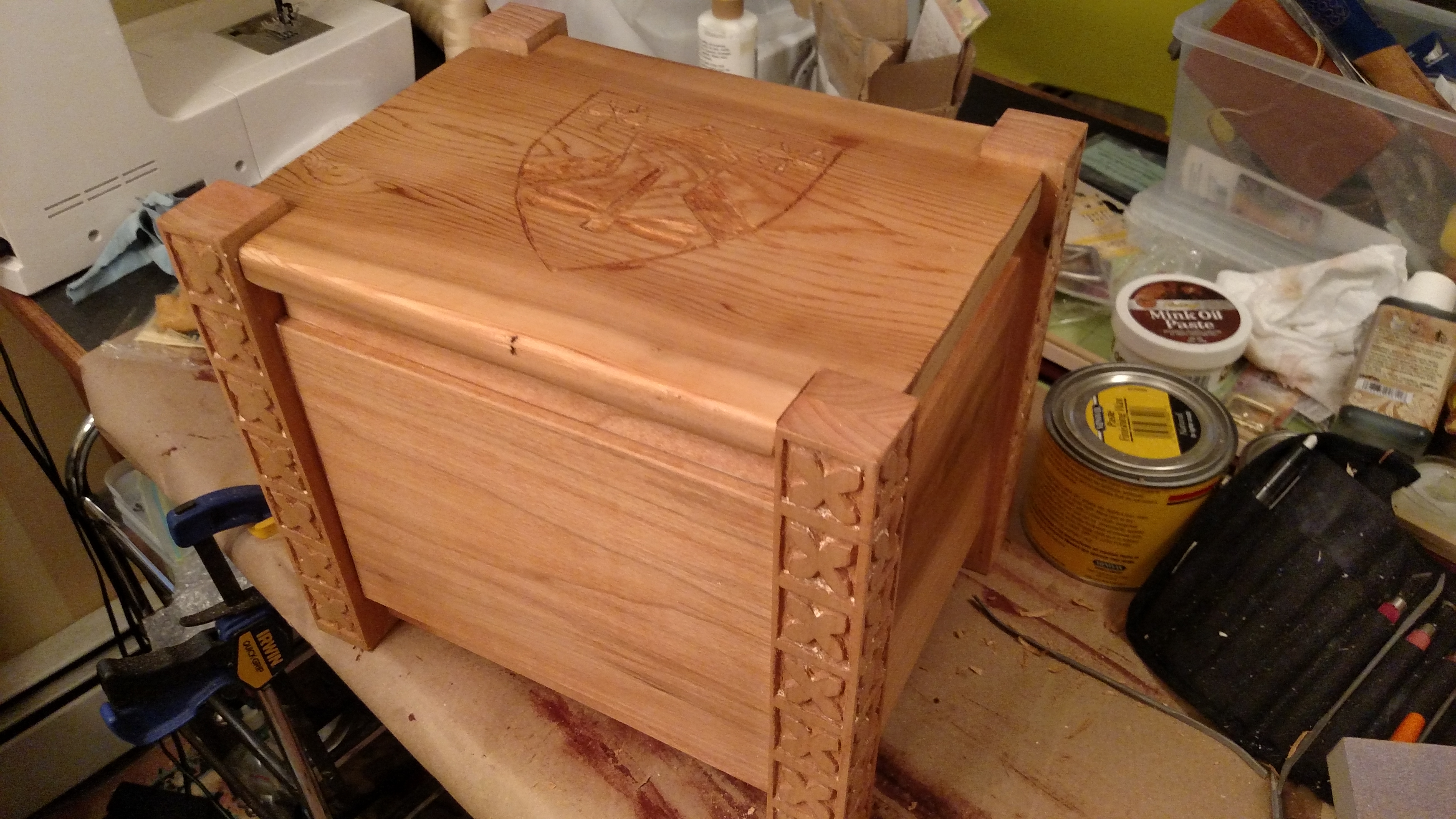
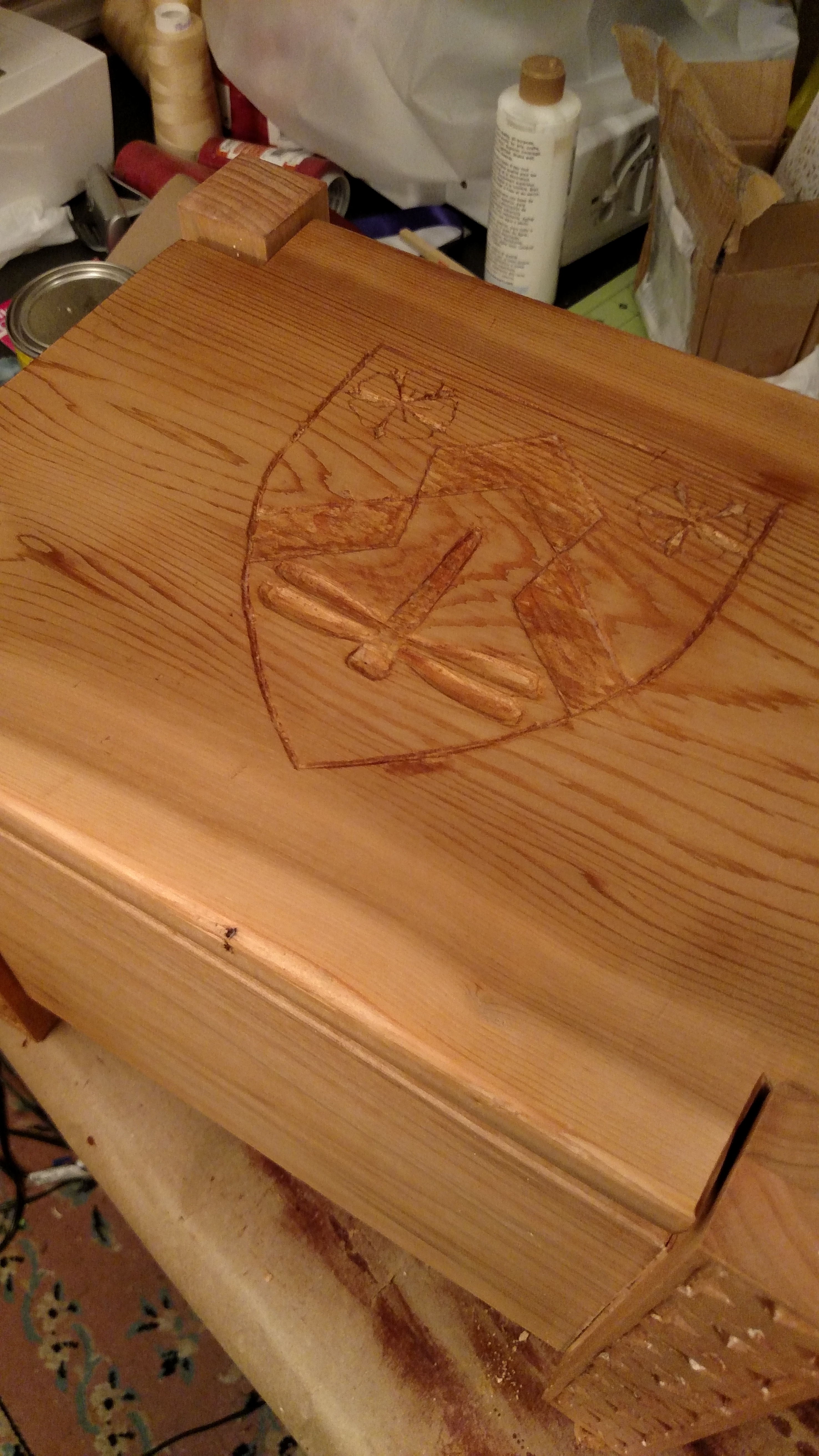
Then I started researching which design I wanted to put on the stone. My initial goal was a man fighting monsters, but the people on these stones are pretty strange looking and few and far between, so I had to go with creatures fighting creatures. While browsing through “Viking Designs” I found one that matched what I was looking for:

I then spent a few days trying to find which stone this design is from, but eventually gave up.

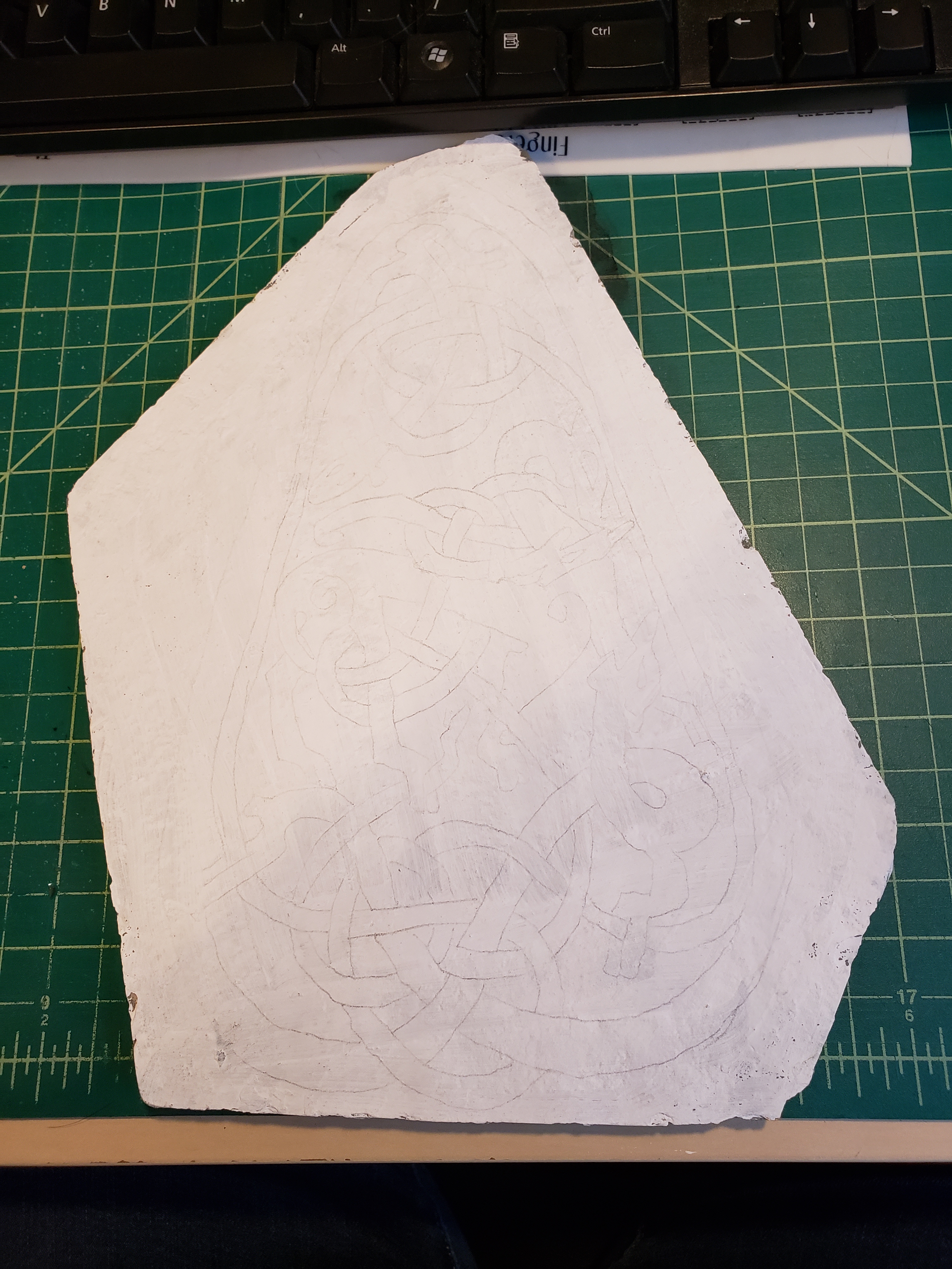
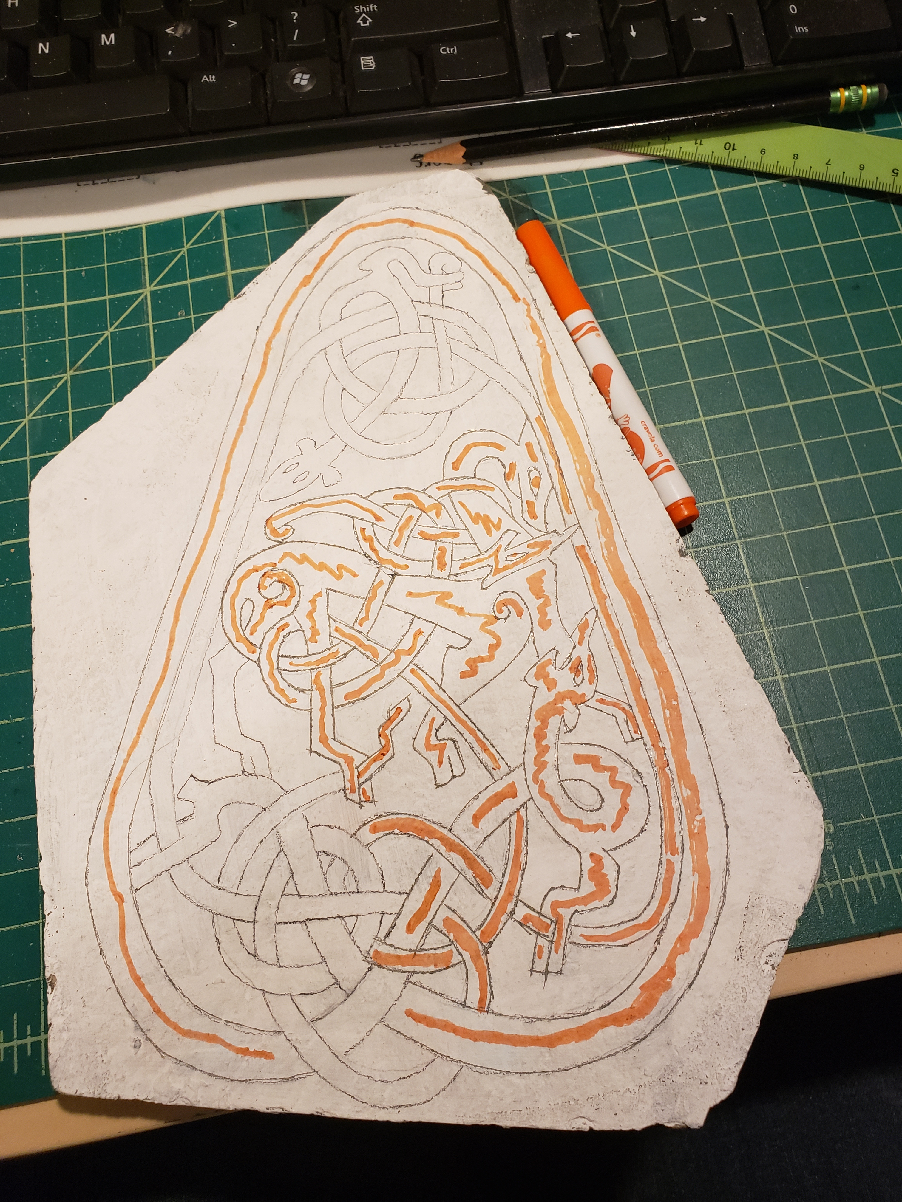
Next was the challenge of how to transfer the complex design to the stone. I had originally planned to freehand the design, but since this was more complex, I decided to transfer it onto the stone. I did a few trials using various chalk and carbon methods but they wouldn’t stay on the stone or didn’t show up well enough. I eventually found an article on the web suggesting that you paint the surface and then transfer the design to the surface, then carve the design onto the stone, so I tried this on a piece of scrap stone and it worked wonderfully!

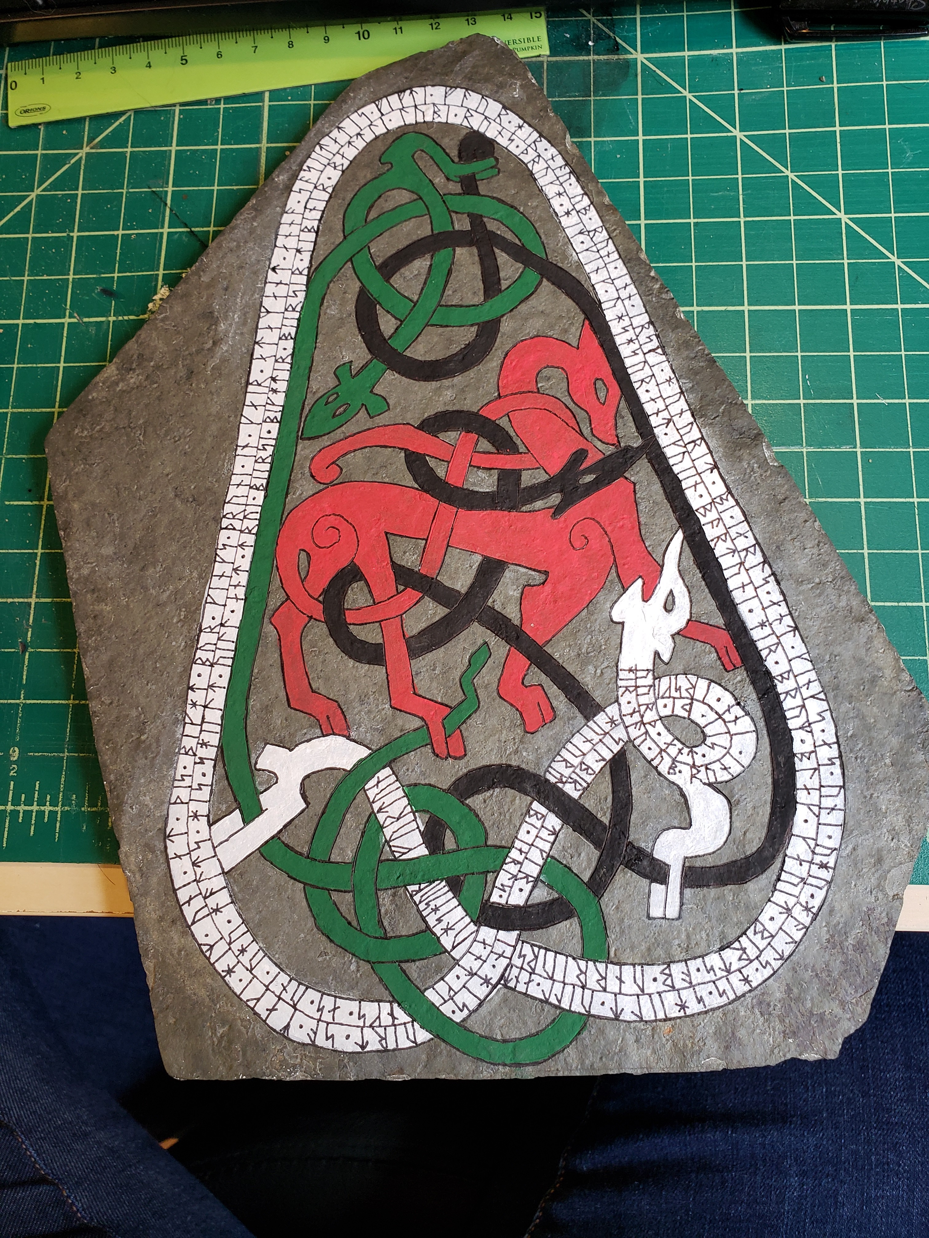
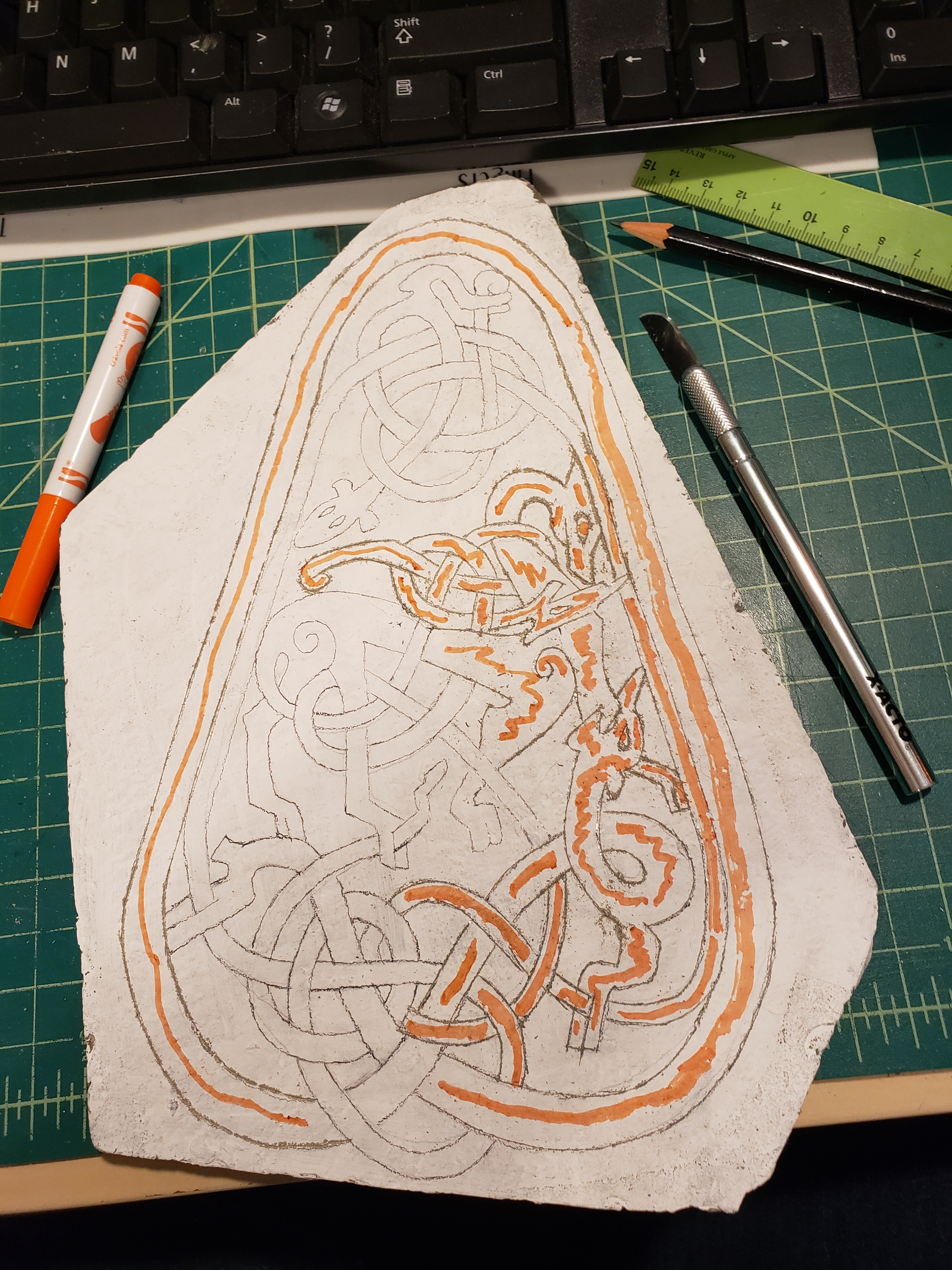
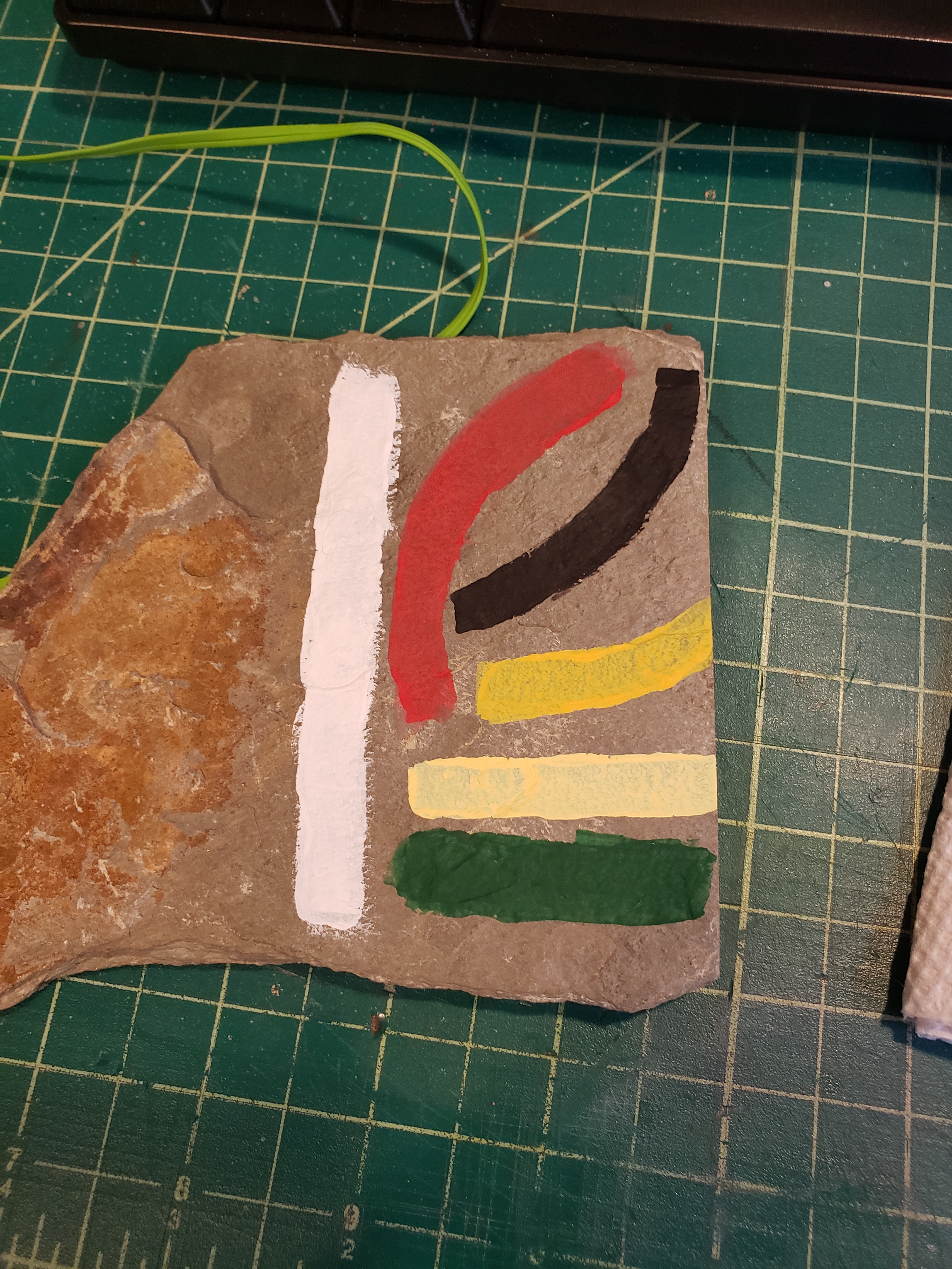
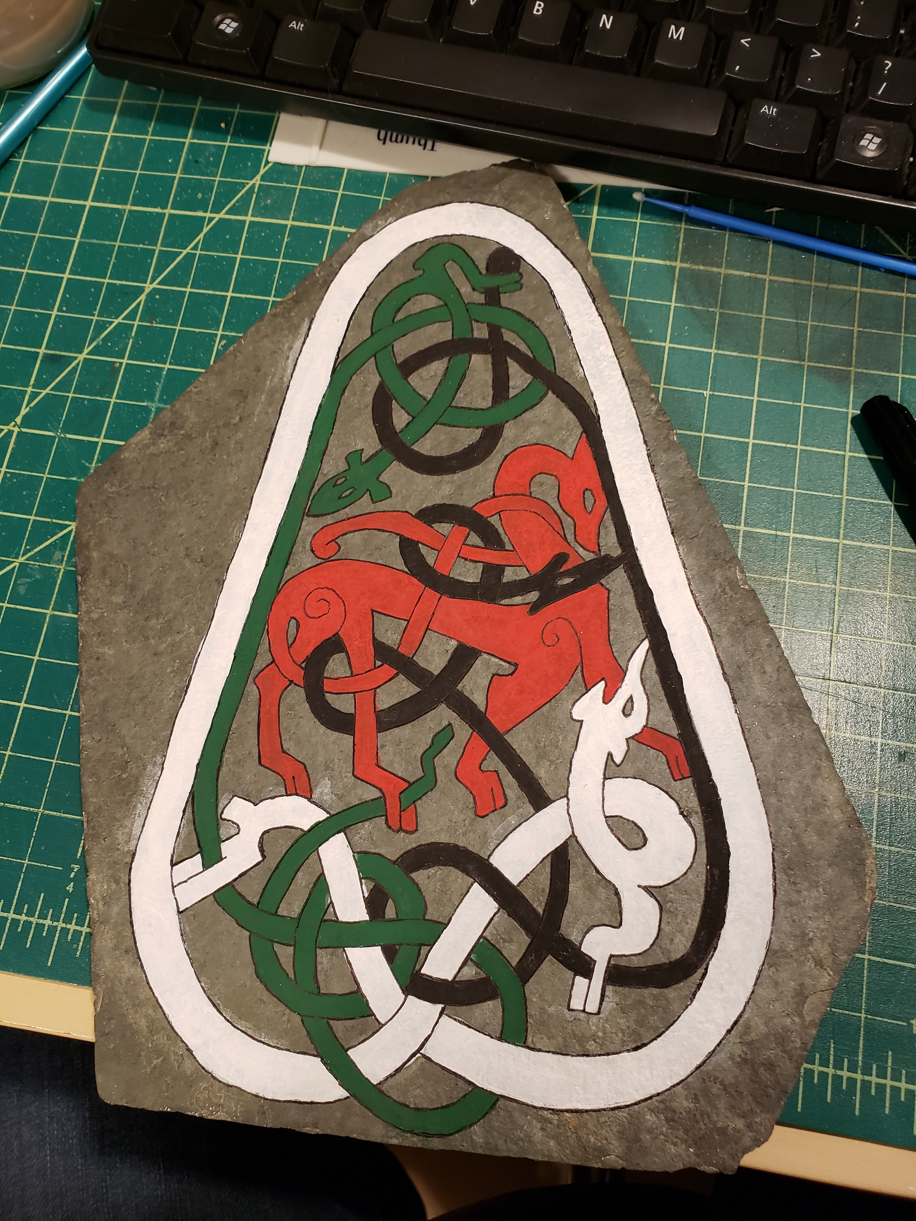
So I painted the stone white, and transferred the design using homemade carbon paper, this didn’t leave dark enough lines, so I went back over all the lines with a pencil. I then inscribed the lines on the stone using a knife. It was difficult to see which lines I had already inscribed, so I used an orange marker to keep track. Once all the lines were done, I washed the stone with soap and water. While waiting for it to dry, I tested the colors I had to see which would look best on the different lines. The colors were chosen as they are similar to colors that the original artists would have had access to, and what has been found in archaeological investigations of the stones. I transliterated the text from English characters into Younger Futhark Runes and wrote it onto the stone in two lines, since there were many more characters than would fit in one line. I cleaned up the edges with a pointed q-tip and called my courier to come and get it, as I was not going to the event this time.

I hope one day I will have time to actually carve the stone, I did a trial of it for this project but I didn’t have enough time to really do it well, so I decided to just go with the paint, but I do now know that I have the tools to actually hand carve the entire thing.

A sister scroll to the last gothic one..

Oh Luttrell Psalter, you are so sneaky, with your pretty pretty pictures and your nice clean calligraphy – you make it all look so easy… like anyone could do that… But no, don’t be fooled, this manuscript lies to new scribes. It whispers “oh don’t worry, it’ll be fine, look at my nice crisp lines and my pretty little s’s, this won’t be hard” when really it’s a deceptively difficult manuscript to copy. Talking to various other scribes, this is a common trap that new scribes fall into, particularly ones who are more comfortable in illumination since it has such pretty pictures, but it is possible to do, particularly once you accept that yours is not going to look quite as perfect as the original.

This is the second scroll I’ve done from this manuscript in the last few weeks, and I figured the first one’s calligraphy was hard because I just hadn’t had enough time to properly learn it, so I figured the second one would go better since I had already put in so much practice time on the first. The second one did go better, but I think I need a few more years worth of practice before I can do this hand justice.

For this scroll I used folio 13 reverso (the back side of page 13) :

I chose this particular page as the person the scroll was for is a thirteenth century harper, and King David and his harp leaped to mind, plus I love this page.

page4full

Here’s my version, a bit simplified:my_work 2016_3_4

Now look back at the previous post, that’s supposed to be the same hand – so yes, I’m making definite progress, but man is this hand hard… I’m going to set this manuscript aside for a little while and go back to my good friends in the proto-gothic world where I can actually feel a little bit of confidence.. But! My spacing and vertical lines look much better. They still need work, but way better than last time.

I try my hand at a gothic calligraphy style

IMG_20160205_110221154

Silver Wheel for A&S Champs, yes, I spelled Championship wrong… And I got carried away on my s’s – I really enjoy doing gothic short s’s now that Karen taught me a trick to them (don’t think of them as s’s, which is basically what to do with long s’s as well..)

It’s based on the Luttrell Psalter folio 53r, Here’s the whole thing online at the British library – http://www.bl.uk/manuscripts/FullDisplay.aspx?ref=Add_MS_42130 and here’s the book opened to the page I did – http://blancefleur.tumblr.com/image/84238302229

I mostly traced this one (the vines and leaves are all free hand, along with the diapering and whitework), but I’m doing a second that is entirely free hand since the images are really easy to free hand and then I can work them into the design I want more easily. I chose to trace in this particular case because I had procrastinated too long and needed to get the shapes on quickly so I’d have time to do all the layers I wanted to do.

Part of the reason I was rushed with this one was that it’s my first with metal leaf, and that took quite a bit longer than I had expected. I used Mona Lisa’s Silver Leaf from their gilding kit, which I highly DO NOT recommend. Firstly the directions are terrible, and secondly, the ‘silver’ is tin, which is fine, except that it doesn’t cut nicely so it’s really hard to brush away the extra that’s not supposed to be there as when you brush it, it rips across the part you do want. I now have plenty of the much better quality stuff to try, but I thought it might be a good idea to start with the cheaper option to see how it went, and as usual, it was miserable.

The calligraphy was all done Thursday night before it went to the event Friday afternoon, which wasn’t my original plan, but as said, the timeline got pretty compressed due to the silver, and then not realizing quite how much illumination I had bitten off until I was well into the process. (Yes, I do the illumination first, Yes, I know this is crazy, Yes, I sort of regret it for this one due to how the lines worked out, but that was also somewhat due to the compressed timeline for the calligraphy as I didn’t have time to do extensive drafts of how I wanted the calligraphy to fit into the scroll.)

It’s not terrible. Ok, it’s pretty terrible, but given how much Gothic and I do not get along, it’s pretty good. The three things I struggle with the most in scribal are 1) word spacing, 2) Verticals being vertical, 3) Getting my feets correctly on the baseline. (Yes, I’m sure there are lots of other things wrong as well, but these are the ones I’m most working on right now). So the big difference with this scroll was that I used Vertical guidelines for the first time, and it’s something.

1) Word Spacing. Within the word, and between words, it’s still not great, but this is probably the best I’ve done so far in terms of my words all being appropriate distances from each other, and the internal spacing in words is pretty decent. I think the vertical guidelines helped the most with this aspect, mostly as they created a grid that I could use to see how far the letters were from each other, and I could count on them to be regular.

2) Verticals being Vertical. This was the reason I used vertical guidelines for the first time with this scroll, and I suspect they helped, but I’m kinda amazingly oblivious to the guide lines, it’s like my hand just desperately wants to slant all my letters every which way and is revolting against the guidelines. They aren’t terrible, but being gothic it’s really obvious when they are slightly wrong. I really need to practice this ALL THE TIME.

3) Feets. Thankfully this hand has mostly flat feets, I’m especially terrible at getting pointy feets to end up in the right place.. but even with flat feets it’s really hard to remember what I am doing – mostly from a serif perspective, I really love adding little serifs, and this hand has very few serifs. But these feets were also supposed to be square, and that was very hard to do without having practiced enough. I suspect my feets would have been considerably better if I had given myself enough time to actually properly learn the hand and not been rushed.

I kinda want to animate my letters as they have definite personalities.. my Ys are so often drunkenly sliding under the table, while my V’s have too much confidence and my As are desperately trying to hold everything together but failing since their mates dislike them for thinking they are perfect.

You can also definitely see me getting more tired and sliding back into prot0-gothic, but it looks okay. ish.

Oh fine, I’ll learn calligraphy..

IMG_20151008_201206341Firstly, a scroll for Donovan’s Provost’s Company, words by Alys. (Oh god, why is my first court presented calligraphy, a calligraphy only scroll, what was I thinking?!)

IMG_20150925_154120844

IMG_20150901_221626521

Then we have a backlog AOA, that I did twice. Once big, (on the right), and then a second time smaller, but with better calligraphy and fewer spelling errors. They both have redeeming features, which is why I’m posting both. I’ve thankfully learned a lot since then.

Little maple box

So we were brainstorming things for a viking persona award, since paper scrolls don’t really fit well, and I had been contemplating making a little box using viking era techniques and suddenly it all fit nicely together…

Maple craft board, made using finger joints and a tongue and groove lid. Glue used to hold it in place.
Man, having a band saw in my garage is awesome! But I couldn’t have done the groove without Troy and Lisa’s help. They had a router and the ability to control it.

I’m planning on making a box for myself next, this time using poplar and doing all the joining by hand. I’ve learned my lesson about carving maple craft board, it’s harder than it looks. This box was a fun little proof of concept piece that gets to live an adventurous life. I’m a little sad it’s getting painted as the maple is so pretty to scrape to a mirror finish and then oil, but I have more maple for later.

This slideshow requires JavaScript.

my first full scroll!

(yes, I know there’s a ‘typo’ in it, I noticed it just as I was walking it over to hand it off for the tournament. oops)

11800655_10154056175989838_187339965_o

This is the first scroll that I’ve done everything (well, not the wordsmithing, but eh, that’s so not my art). I had planned to make it more complicated and period, but in reviewing the requirements, I decided simple made the most sense, particularly as it’s theoretically going to be traveling to and from Pennsic.

It’s not my “best” work. But it is my first done work. And pulling off the band-aid and just getting the calligraphy done was by far the hardest part. I’m also pretty sure that my brain is incapable of doing things the same way twice, or evenly, or spaced right. I doubt I’ll ever be good at calligraphy or enjoy it, but I might get to the point where I don’t hate seeing my work.

It’s theoretically a humanist hand. Really, it’s basically foundational which is a modern amalgamated hand based on Carolingian, Humanist and italics. The little people based on this photograph:0

Box of dooooom.. I mean, a beautiful, hand carved chest.

So I decided that I wanted to try some relief carving for this round’s East Kingdom Artisan Exchange project. My matched person wanted a “chest”. This leaves a lot of room for interpretation. I mean in period, a chest could be anything from a tiny casket for ritual items to a large sideboard like item where you’d keep the china. Clothing/Blanket chests existed, but are relatively rare in museums because they were more utilitarian objects. There are a few marriage chests available to study, but they tend to be pretty simple.

So looking at the chests at the Met that are within time period (roughly) and of the materials I have at hand we have these five beauties:

(1) A local, slightly out of period chest – http://www.metmuseum.org/collection/the-collection-online/search/1997
(2) A 16th century wooden chest that shows its construction methods (Dovetail) – http://www.metmuseum.org/collection/the-collection-online/search/463014
(3) Another 16th century wooden chest, this one in the panel style – http://www.metmuseum.org/collection/the-collection-online/search/197174
(4) A 15th century wooden chest with amazing relief work – http://www.metmuseum.org/collection/the-collection-online/search/467789
(5) An early 16th century wooden chest done in the panel style – http://www.metmuseum.org/collection/the-collection-online/search/467748

Given time constraints, my budget, my current skill level and the needs of the modern Scadian, I decided to go with a simplified version of (1) and (3) that would be big enough to put a coronet inside, along with other precious items, but not so big that it couldn’t be brought along to an event. I was specifically inspired by the wooden mirror boxes I saw at gulf wars. I then contemplated various pre-made box options that I could embellish, and discarded them all as not right.

So I’d have to make my own box! I then found this fascinating website about early joinery (the act of making boxes, cabinets and other things like that) – http://www.buildingconservation.com/articles/earlyjoinery/early_joinery.htm and decided that the best technique for this project would be frame and panel. The carving design is based on strapwork images from the late 1500s.

The easy way to do this is with cope and stick joinery. The way we see this most often in our daily lives is through IKEA: pegs and holes are used in place of nails. This made up the frame portion of the box. After fitting the whole thing together, I marked all the pieces and then took it apart so I could carve it.

2015-06-03 19.30.56 2015-06-03 20.23.56 One of the nice things about this method allowed me to take the uprights with me to various events and such to work on them in any spare time I managed to find. I went with a simple quatrefoil tracery design that would have been common in period on a middle class person’s small chest.

Despite having much better tools, most of the carving done on these frame pieces were done with my cheapest knives, the ever helpful Niji knives. I ended up using them so much that I had to round the end of them to be more ergonomic because I was using them for so many hours every day. But in comparison to all the rest of my much nicer knives, these were the ones that were small enough to get into the tiny spots and were best suited to incising the design and then 2015-07-03 14.28.07
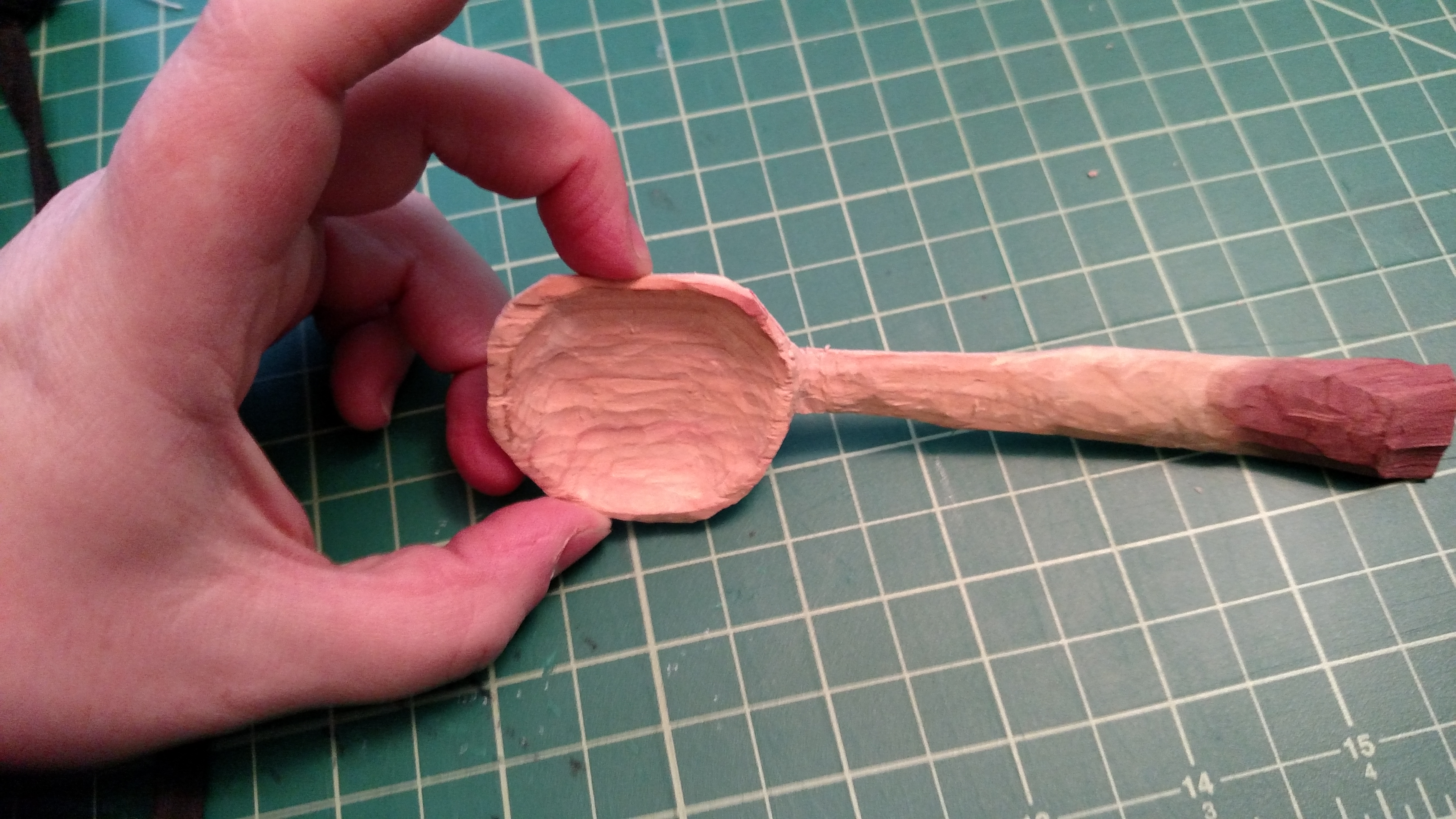
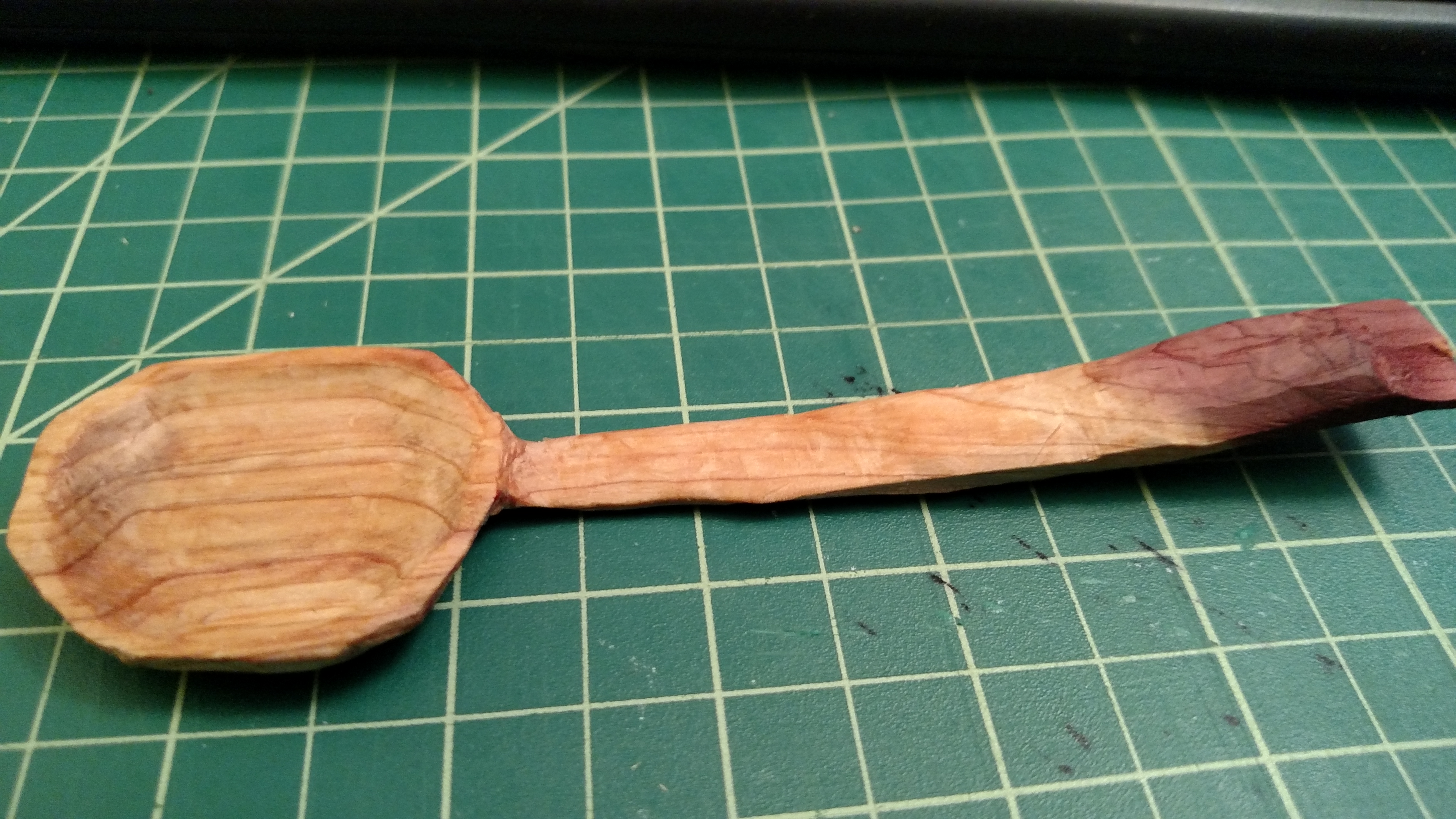
removing the extra material. 2015-07-08 20.41.12  2015-06-17 14.48.59

The individual flowers are approximately an inch across, and have about a 1/8 of an inch of space between the flower and the 1/8 inch border. I had originally planned on carving the front panel and the top and bottom frames on the front, but I ran out of time. I think it ended up looking good in the more simple form. (Which is our modern fashion speaking) I had also planned on carving out each petal and the center bit, and my test piece shows this option, but it just proved too time intensive. I definitely want to a similar project again with more relief carving, but let’s remember this was my first time doing this. The first upright took me about a week, the second a weekend, the third two evenings and the fourth took most of one day. And most of my increased speed was due to realizing that it worked much better to incise everything first and then do one whole side assembly line style – cut out the top bar on all seven, then cut out the bottom bar on all seven, then cut out the side bar on all seven, then the other side, then the triangles on the edges of the flowers and then smoothing the background into a unified surface. 2015-07-08 20.41.18

Luckily we learned a very important skill during the reign – always complete everything to the same state before going on to more detail – that way if you run out of time (And boy did we ever run out of time, over and over again) you have something that is balanced rather than one highly ornate sleeve and no collar, cuffs or hems done. So I built the frame fully, then I built the panels fully, then I did the incising, then the bulk of the material removal, then a few rounds of detailing and smoothing, and then I put the whole thing together and stained it. Then I applied the wax finish to protect it.

Though I did leave one big detail out- the lid!

Due to the nature of poplar trees (they aren’t very big) I was unable to get a board that was wide enough to be the lid on its own. My initial plan had been to biscuit join to boards together and then cut out the lid from that larger piece, but I was reminded by my laural that that would take quite a bit longer and there were plenty of pieces of scrap wood hanging out around the shop that I could use instead. I climbed up to the wood storage and found a lovely piece of cedar that was exactly the right width. I then pieced the whole box back together again and glued it in place using wood glue (Animal glue was used in period for small wooden things (and cabinetry) like this as the pieces are too small to use just wood expansion to hold everything in place, and the glue made it much more stable in a variety of weather conditions.) and a framing jig to keep everything square while it dried.

2015-07-03 16.59.042015-07-03 17.02.13    2015-07-03 17.55.03

Once it was dry I took it home and fitted tiny carved splinters of wood into all the holes and gaps to improve the structural integrity and make it more secure for use. I then sanded it down and went over all the flowers with a fine finishing tool to make sure there the surface was ready for staining. I chose to use a light stain over the poplar to make it “match” the cedar a bit better. I decided to stain it in general because the wood has an interesting grain pattern and it would make the color more even, while providing it with a finish that will help the wood age more evenly. In period this box would probably have been varnished. But varnish is a pain to work with and requires chemicals to clean up afterwards, so I finished the whole box with a light coat of wax paste and buffed it out, leaving a finish that seals the wood’s pores and makes it more durable for every day use. Here is the finished box with the cedar lid with the arms of the recipient on the lid.  2015-07-09 20.12.362015-07-09 20.12.28    2015-07-09 21.17.03

Maple blunt end spoon? Spatula? Saute tool?

I’m not really sure what the technical term for this kitchen tool is, but it’s my favorite go to tool. It’s wooden with a nice sturdy handle, a blunt end, curved inner surface and open ended. It’s great for sauteing in pans where you are concerned about scratching the non-stick surface. It’s capable of “scraping” up the edges and getting the crispy bits, while also being useful for flipping and not terrible for serving. (Though it is often pointed out that we have many better tools for serving)

This I made from a maple board I bought at home depot. The wood is quite nice, hard but carvable, and very pretty when oiled. I cut the general shape out on the bandsaw and then carved it down to size using my knives, gouges and sweeps. I then made the surface smooth by scraping it with the cabinet scrapers, which were perfect for removing the tool marks without sanding the wood. They also leave the surface with a bit of a burnished feeling, which I quite like, particularly on this soft maple.

The neck is offset by a bit to make it easier to use, and to provide better control.

2015-02-26 20.42.292015-02-26 20.26.572015-02-26 20.34.25

New hybrid loom!

2015-02-10 18.40.28Aren’t computer keyboards supposed to be used as wood-shaving collectors? I added a beater edge to one of the shuttles I cut out on Sunday. Which came out rather well. It could probably use a bit of sanding, but it’s entirely functional currently!

The glue on my loom had finished curing, so I took the tension peg from my large loom and warped it up with some black and copper thread. I’m hoping to manage to figure out pick up work this time, but given my luck with it thus far, I’ll probably just have Halloween trim.

Which really, not a bad thing! I’ll probably use it for something. The total warp length appears to be around 8 feet, though I haven’t actually measured it yet. I just estimated with the fingertip to nose trick. I think it’s just about the same as my big loom, and yet weighs so much less and is much easier to work with since it’s about half the size. It’s only a little bit bigger than Carly’s tiny loom, but I made the shed area longer so I can better try to do tablet weaving on it. (that’s one issue with the tiny ones, the distance you have to work with is not very useful for any fancy card weaving/double heddle/weird non straightforward inkle weaving. But the small size is much better for experimenting and travel.. I’m hoping with this loom I’ll have the best of both worlds.

2015-02-10 22.11.52

Today’s woodworking, brought to you by the letter S for snow

So while I was over at Alex’s on Wednesday I borrowed his jigsaw to cut out the first loom iteration from some half inch plywood I had purchased a while back.

Lessons learned:

* Don’t use sharpies for lines, it’s a pain to “erase” since it seeps into the wood (I knew this, I just keep screwing up and need to remember this)

*Curved lines are easier, plan with this in mind

*Plywood will de-laminate. Need to figure out how to avoid this when cutting or drilling into it.

So with that part done, I put everything else I’d need for the loom into my car to wait for my next available time to borrow Rozi’s shop and drill holes for the pegs. Also I needed to cut pegs. And sand them.

When the snow today ended up not being that bad during the daylight hours, I emailed Rozi to see if I could come over and use the shop for a little while. She said yes and so I was off and running.

I had two dowel sizes to work with 3/4″ and 1/2″. Alex and I discussed my options and we thought it might be a good idea to use the larger ones on the outside corners since they seem to get more stress than the inside pegs on the loom, but when I got to the shop I failed to find a way of drilling 3/4″ holes, so I went with all 1/2″ inch holes.

I also had two choices, a regular drill bit and a spade bit. I tried both, both left splinters on the backside of the plywood. I’m still not sure what difference the two options made, but they both worked for my purposes.

2015-02-08 18.39.21
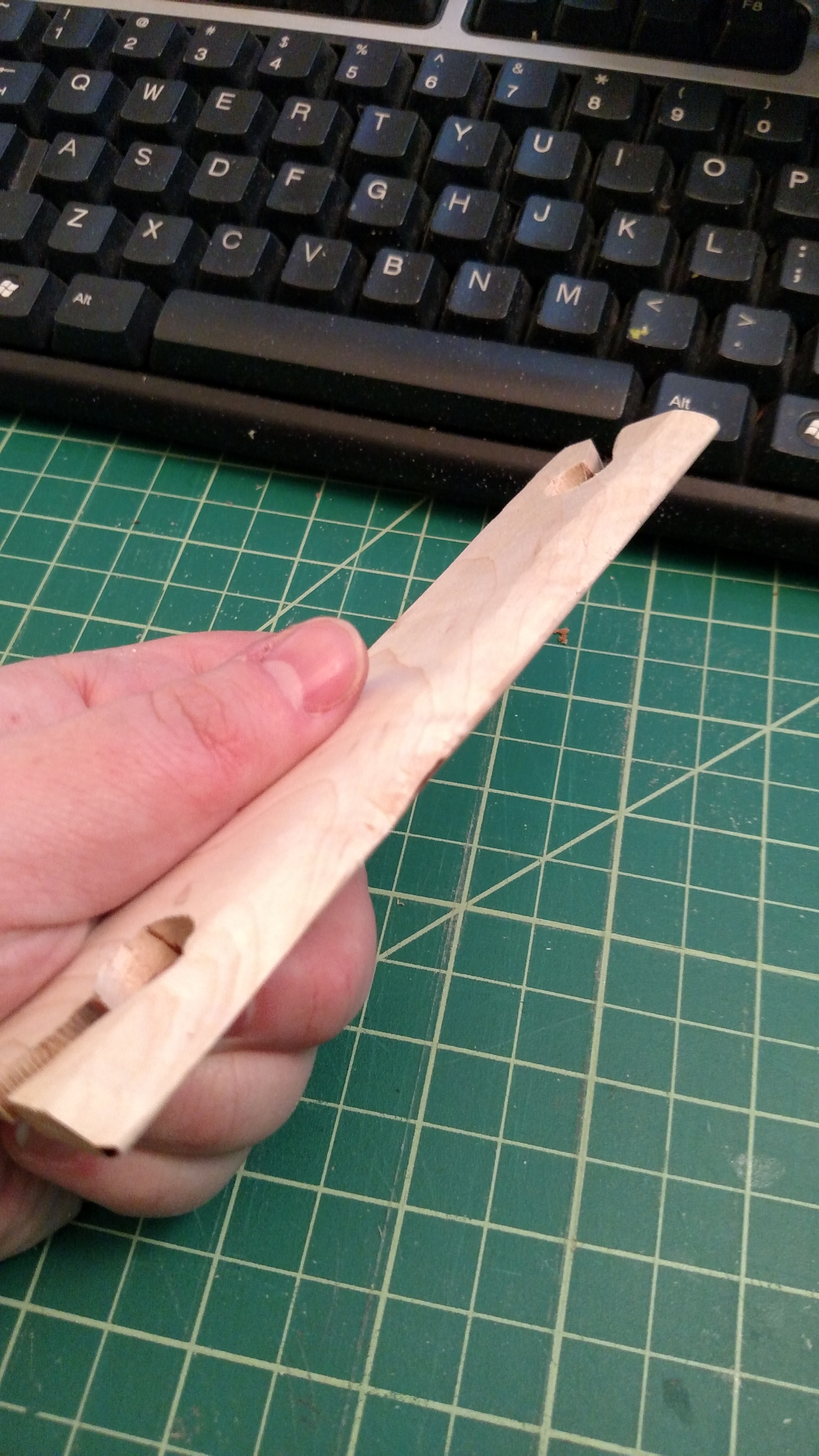
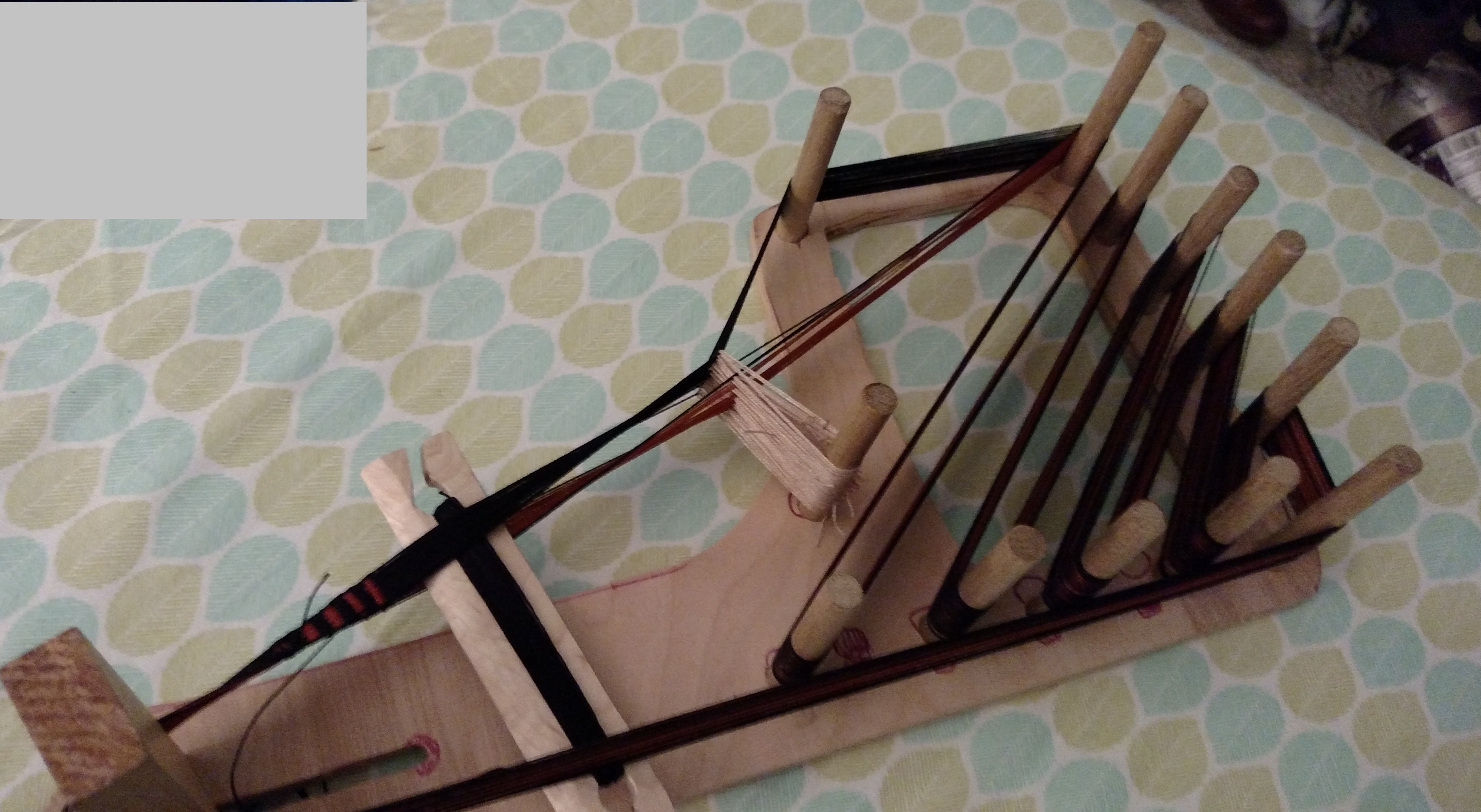
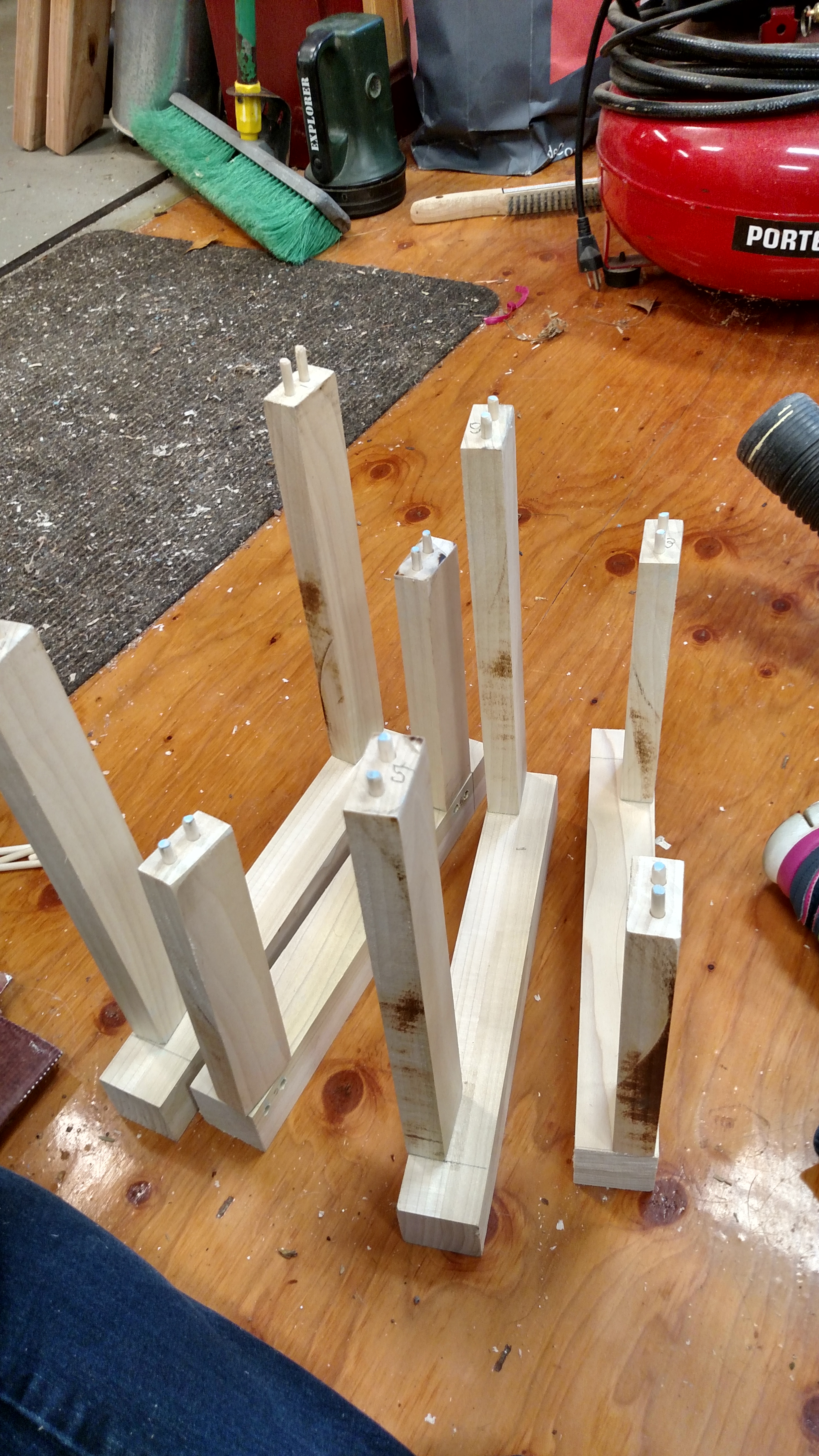
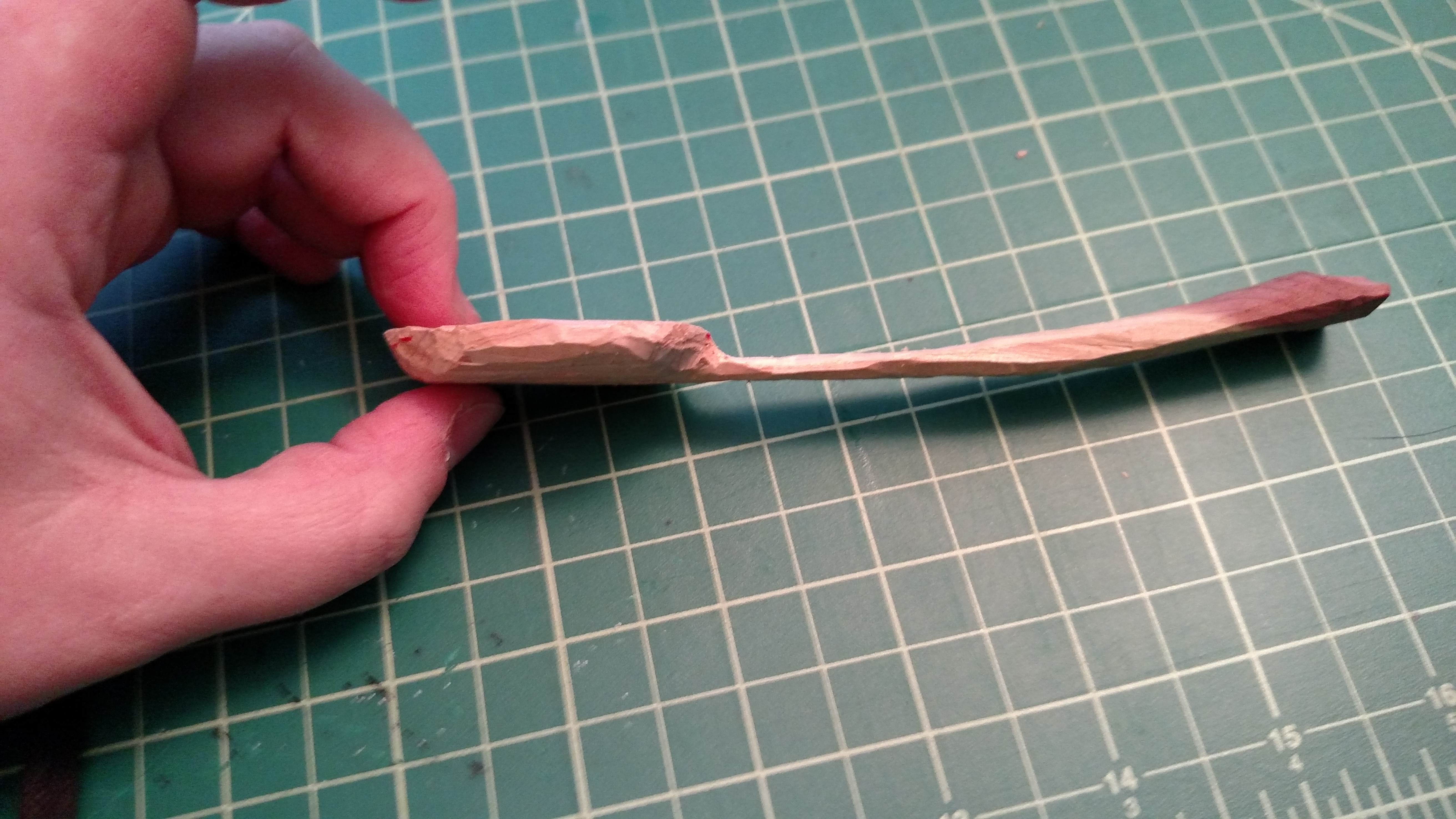
Once I had all my holes drilled I cut my pegs and sanded off their sharp splintery bits on the ends. And then I remembered I had 4 shuttles to cut and drill also, so I went back and did that and then sanded them to be not spiky. Though at some point I need to put an edge on each of them as they currently aren’t terribly effective beaters since they are blunt. But I’m curious if my design for how the string goes on will work better for me since I have a hard time keeping the string from falling off. Also man Maple is pretty.
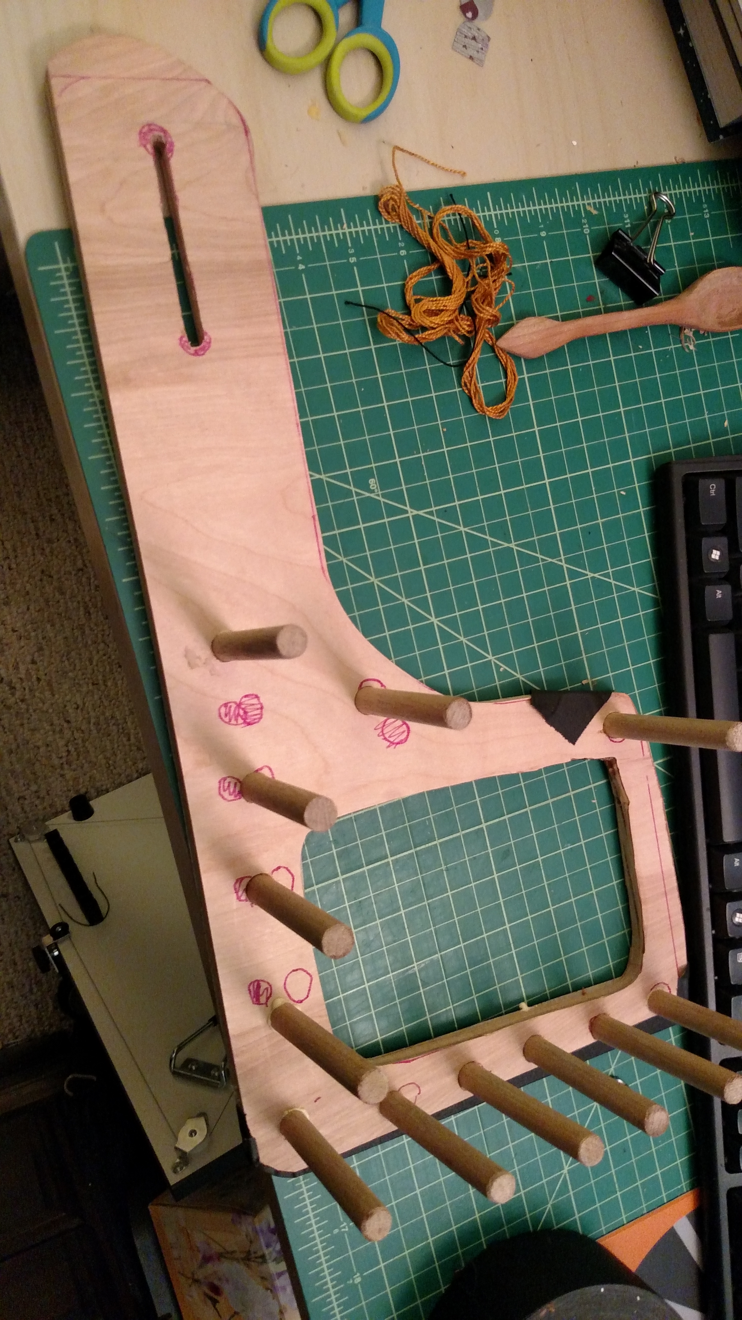
Then I headed to the hardware store to get a bolt for the tension peg, which is great and all, but I need to now make a tension peg and drill a hole in it for the bolt.. Perhaps Wednesday.. Or I might just use the one from my big loom for now. And then home to glue it all together.

2015-02-08 18.27.30

I expanded the tension peg hole a little with hand tools and softened the sharp edges of the peg holes with my hand tools. I then put gaffer tape (it was what I could find, I wanted masking) on the back and put some wood glue in each hole and then put the pegs in, twisting them up and down to best distribute the glue. It’s sitting on a shelf now drying. We’ll see in 24 hours if it’s good enough. I really should have cut holes slightly smaller than my pegs and then forced them into the holes, as it was they slide in easily and I’m not sure if the glue will be enough to hold them properly.

While I had my hand tools out I worked a bit more on my ceder spoon. It’s coming along beautifully. It’s so light and petite. The bottom picture shows it with some butcher block oil on it, and a bit of burnishing work on the bowl to make it smooth and remove all the tool marks. It’s amazing how much adding the oil and burnishing makes it feel more substantial and sturdy. It weighs about as much as a soda bottle cap, but no longer feels like it would break with use. The bend in the handle is based off of one of the Uppland finds, and it really makes for a rather comfortable eating spoon.

2015-02-08 16.22.07 2015-02-08 16.22.13 2015-02-08 18.33.45

Previous Older Entries