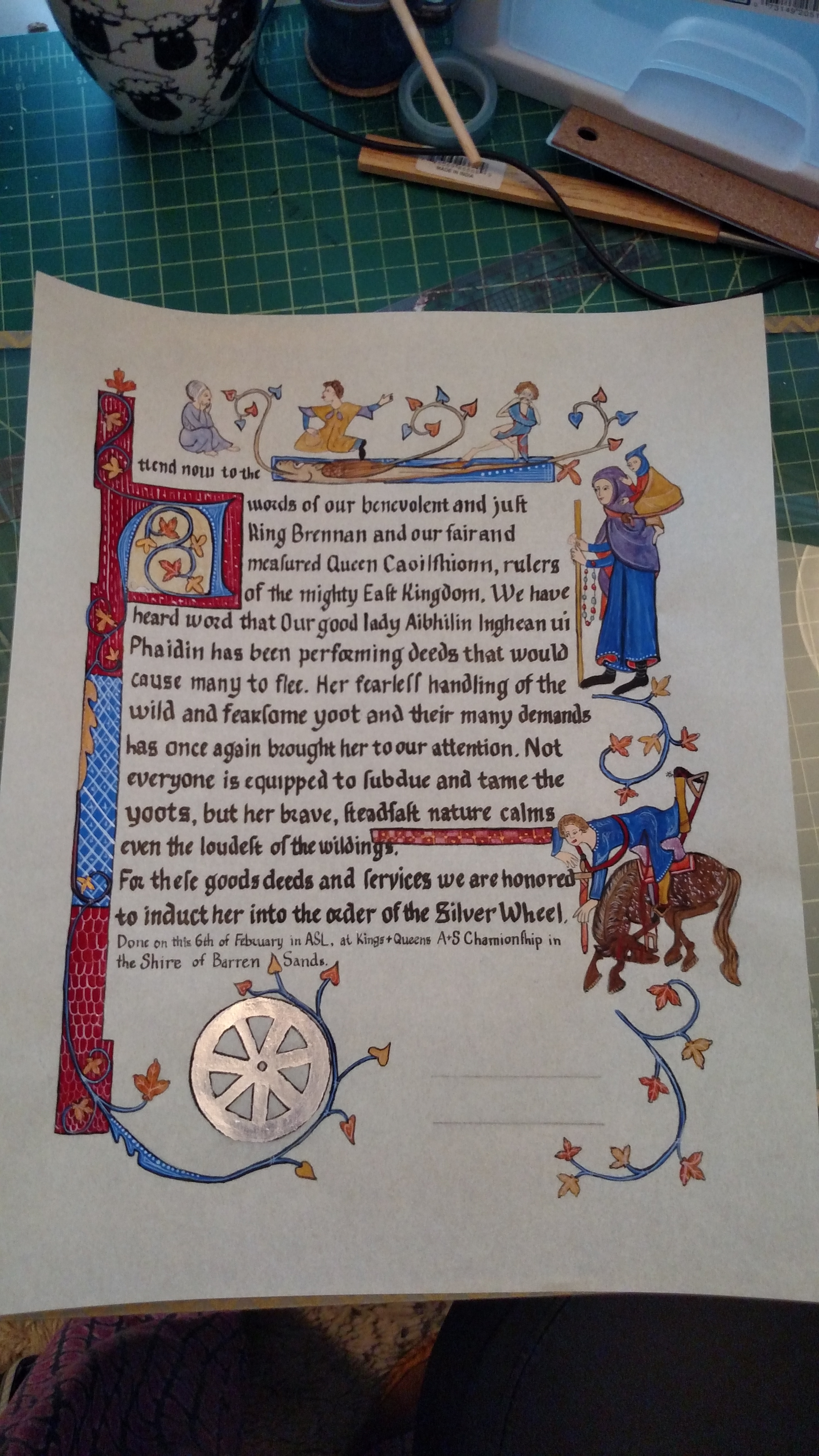
Runestone scroll – May 2019

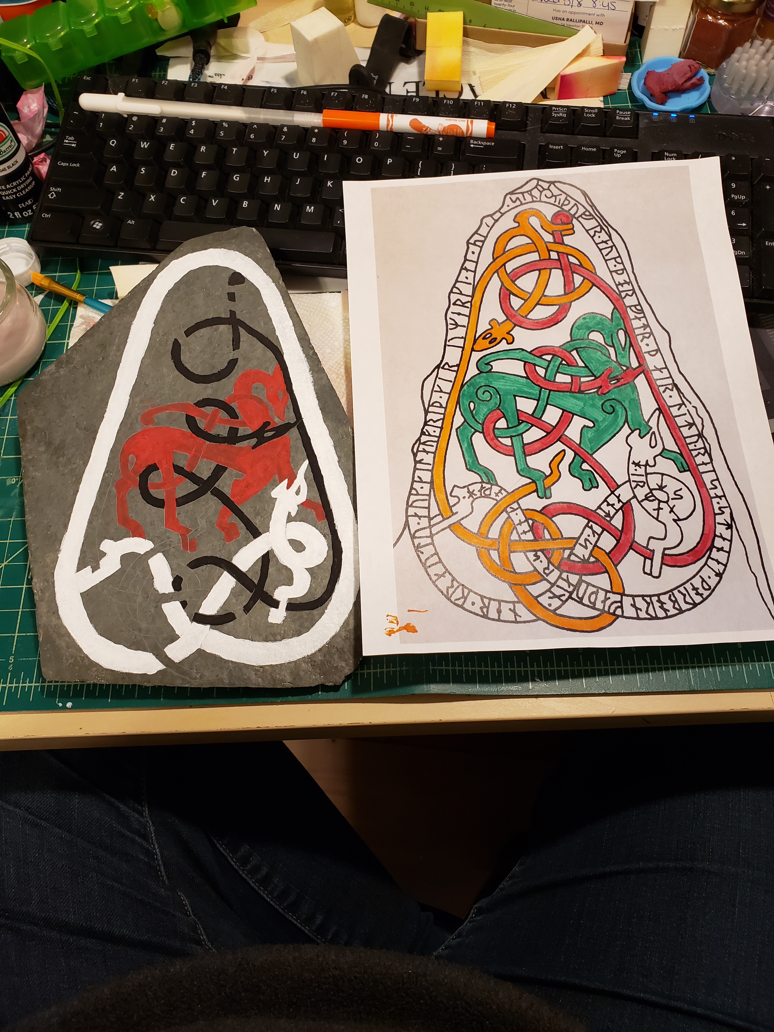
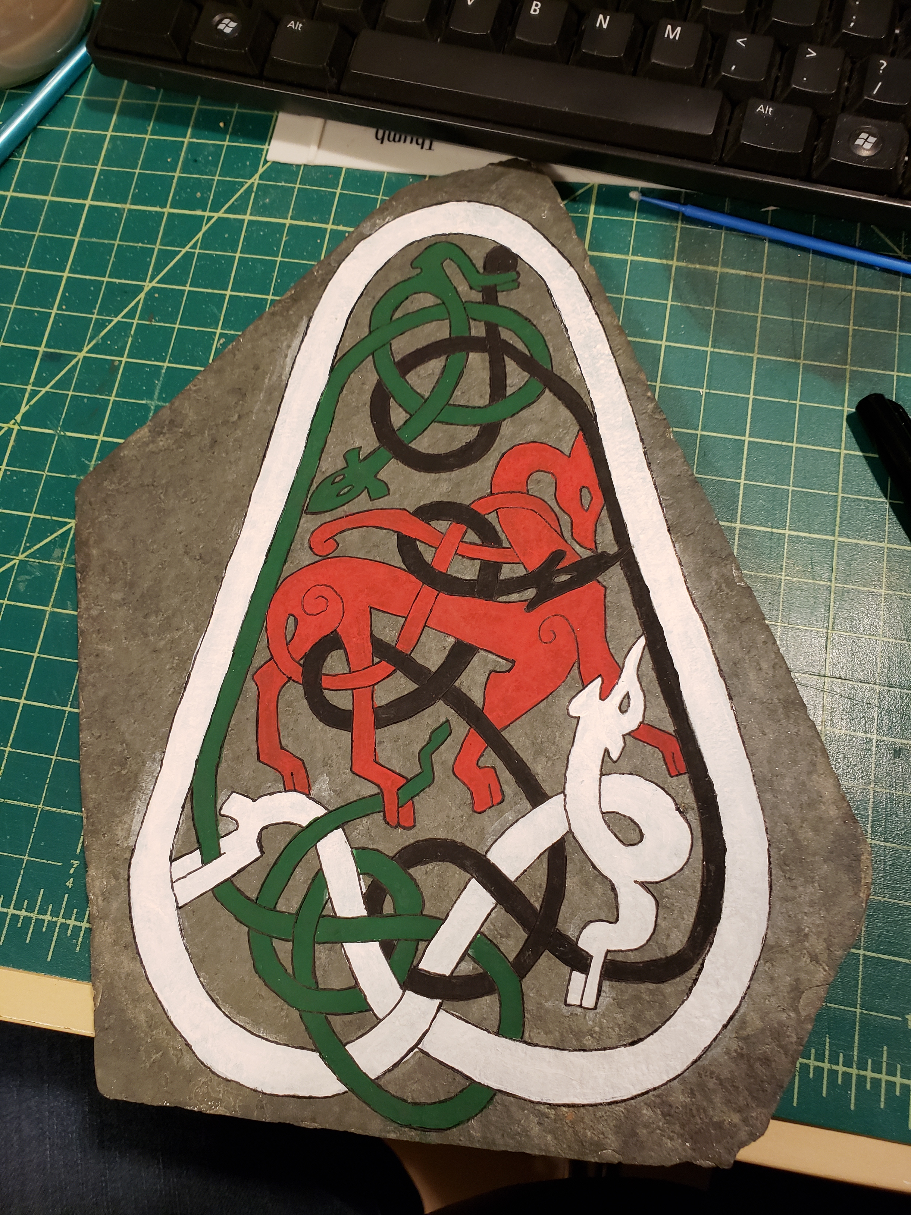
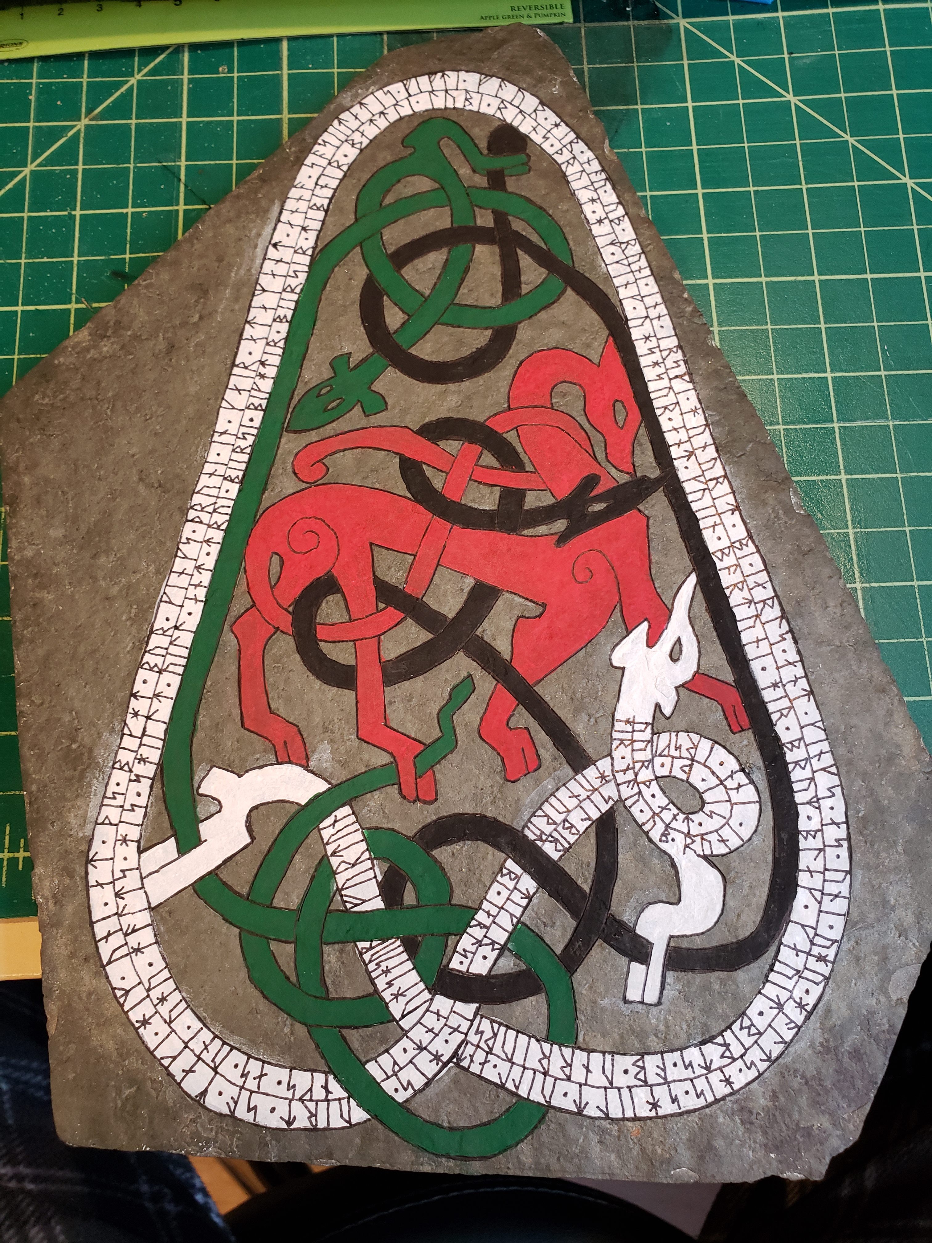
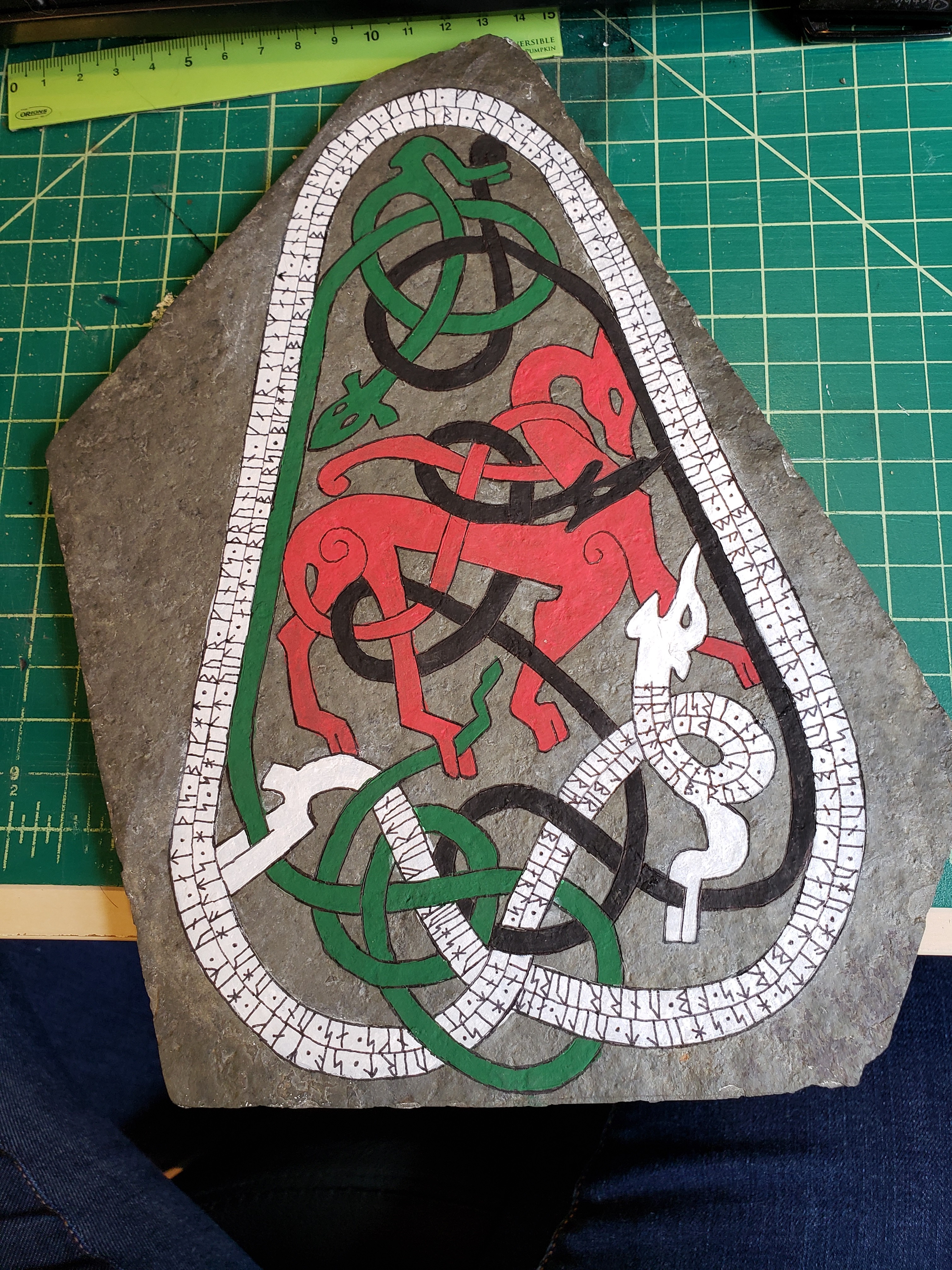
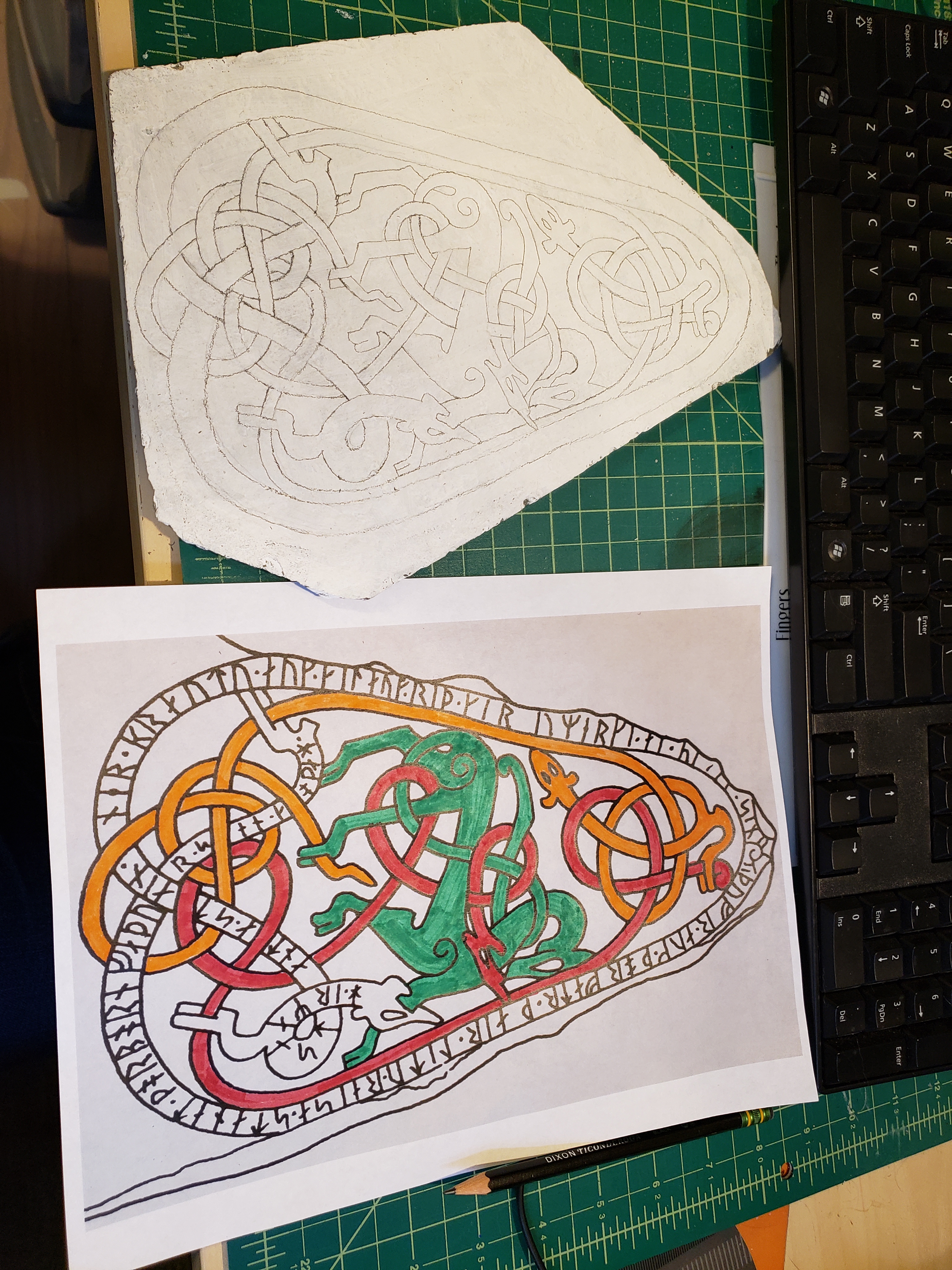
This is my first runestone that was based off the Uppland Sweden standing runestones. It’s based off of one that I can’t find online, but is in the Dover press ‘Viking Designs’ book, and I can find the rest of the ones on the page, so I’m assuming it’s just not digitized yet. If it does not actually exist, it’s at least very much in keeping with the style, so I feel it’s ‘close enough’.

Here’s the finished scroll –
Now to tell the story…

The award write up I received, told of a brave viking warrior who has joined our society in the last year or so, and has made every effort to better himself in the art of war. It was suggested that he would enjoy a scroll with runes on it, which immediately my mind went to carving him a stone.

I passed the award recommendation to fellow Silver Brooch Sisuile Butler who had told me a few weeks earlier that she loved writing words. (Music to the ears of most scribes!) While she worked on the words, I got to work on the stone.

I had planned to raid the stash of flagstones that Leanne and I had bought a few years ago for such projects, but due to scheduling and such, it was easier to just go get another batch of them from Home Depot. (Plus, now I have my own stash, just what my scribal closet needed…) So one of the many rainy days of April, I went over to the local Home Depot and grabbed two bags of soaking wet stones. Had the weather or light been better, I’d have picked out the perfect set, but given the conditions, I went with two sets and hoped for the best. Once home I set out all the stones I had acquired and found one that would stand up on one side and look about right for the job.

Then I started researching which design I wanted to put on the stone. My initial goal was a man fighting monsters, but the people on these stones are pretty strange looking and few and far between, so I had to go with creatures fighting creatures. While browsing through “Viking Designs” I found one that matched what I was looking for:
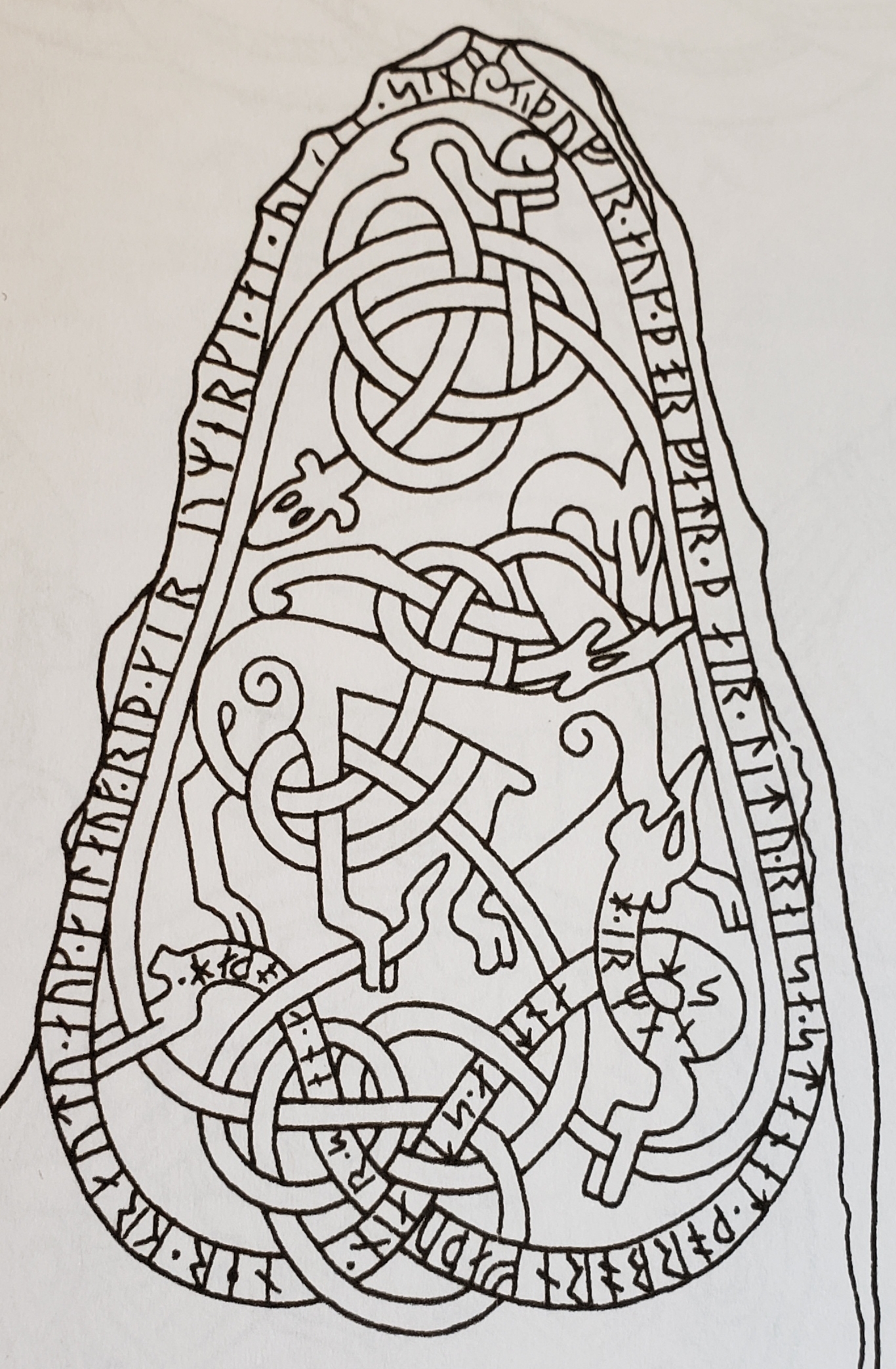
I then spent a few days trying to find which stone this design is from, but eventually gave up.

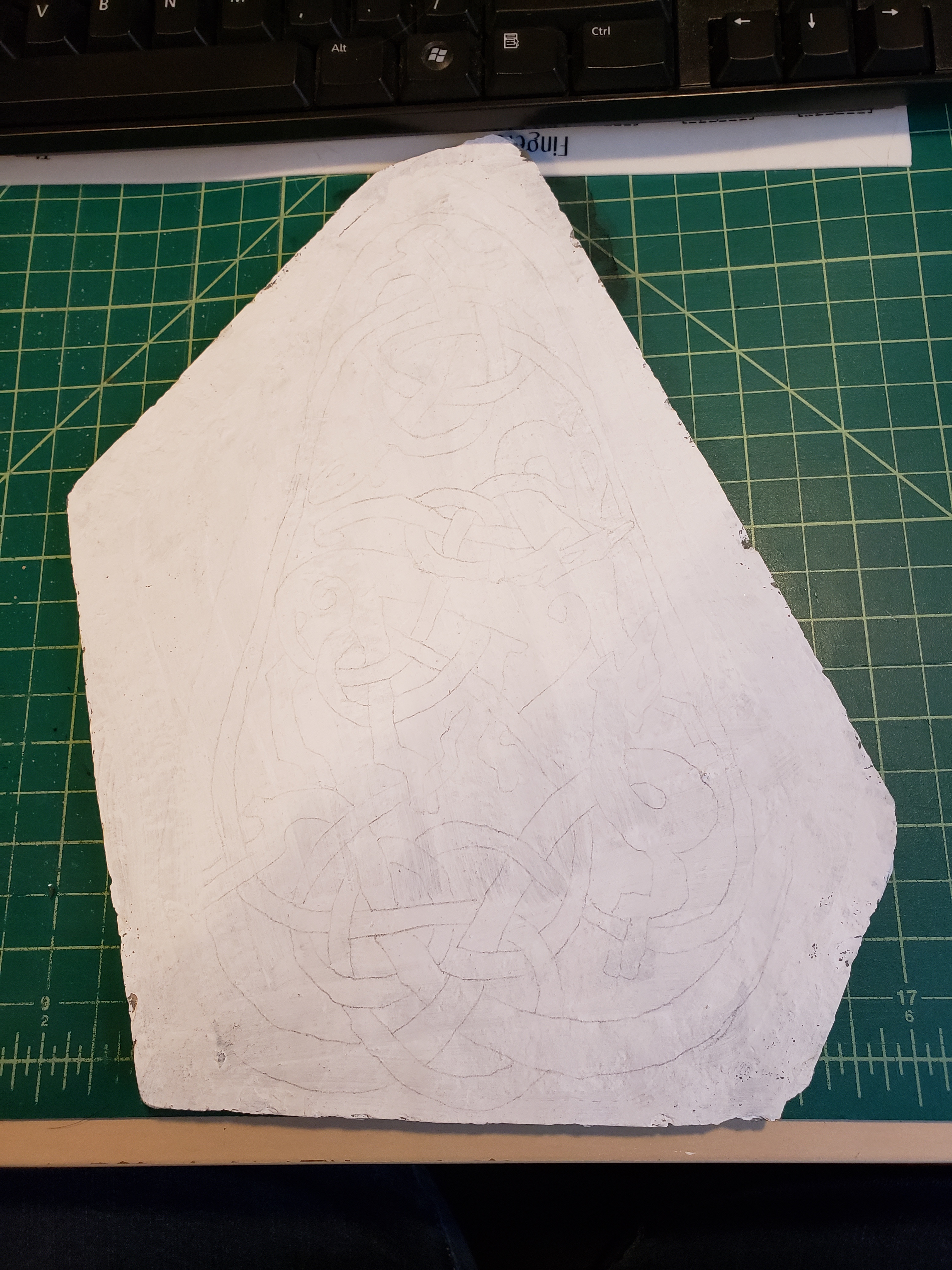
Next was the challenge of how to transfer the complex design to the stone. I had originally planned to freehand the design, but since this was more complex, I decided to transfer it onto the stone. I did a few trials using various chalk and carbon methods but they wouldn’t stay on the stone or didn’t show up well enough. I eventually found an article on the web suggesting that you paint the surface and then transfer the design to the surface, then carve the design onto the stone, so I tried this on a piece of scrap stone and it worked wonderfully!

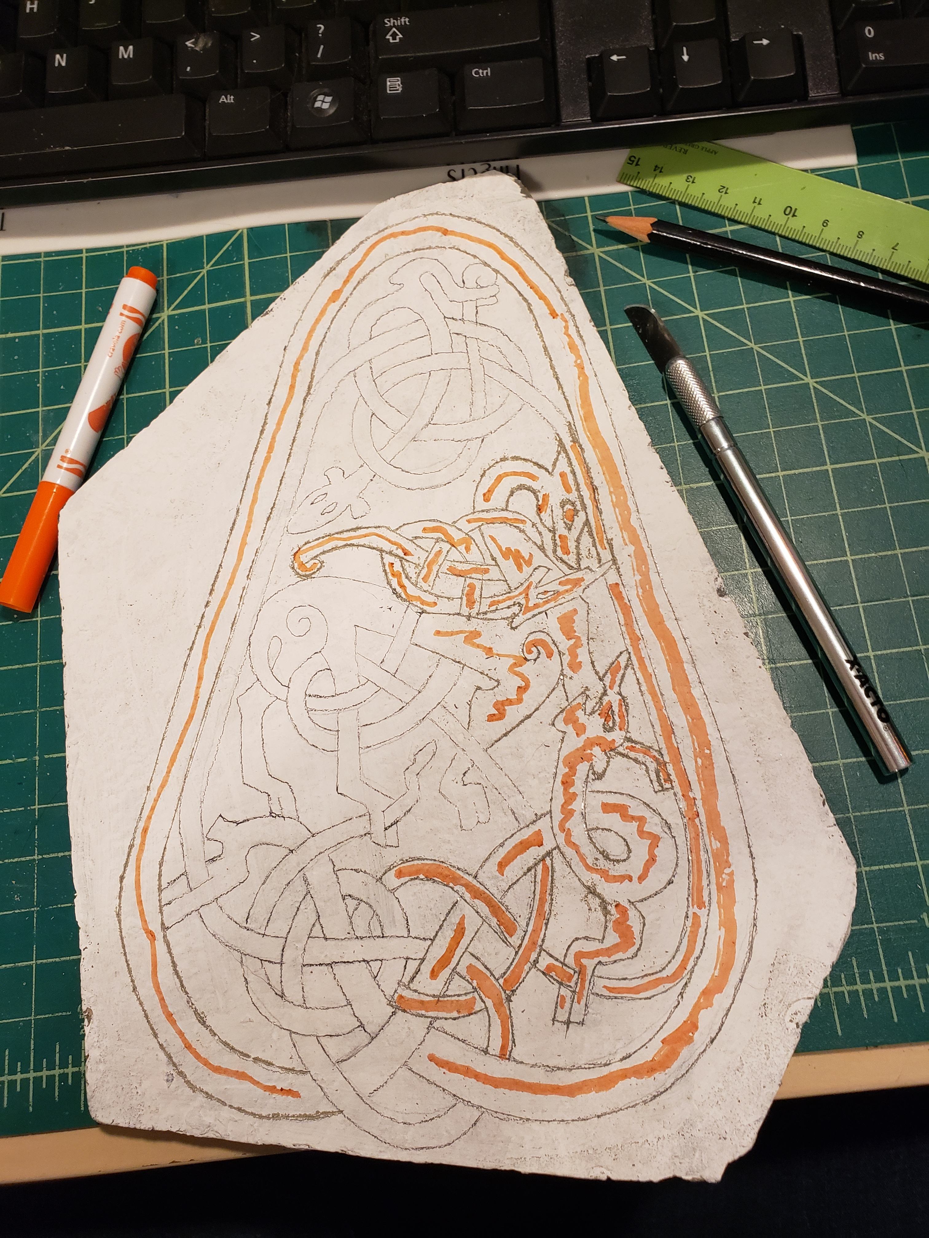
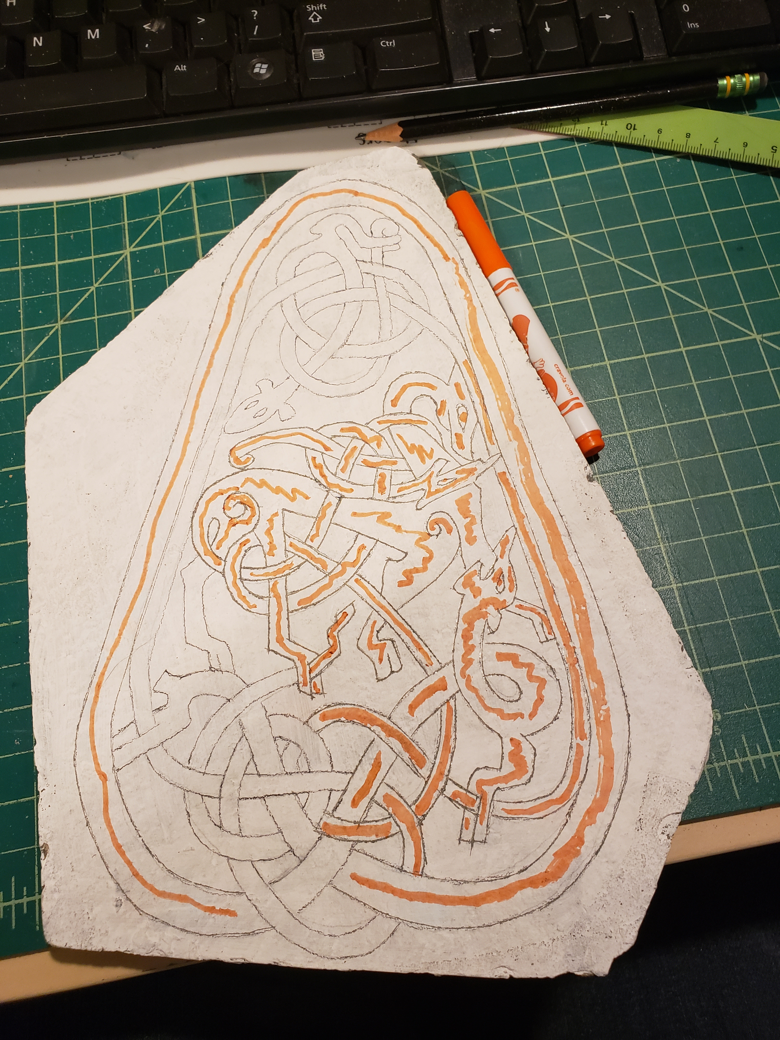
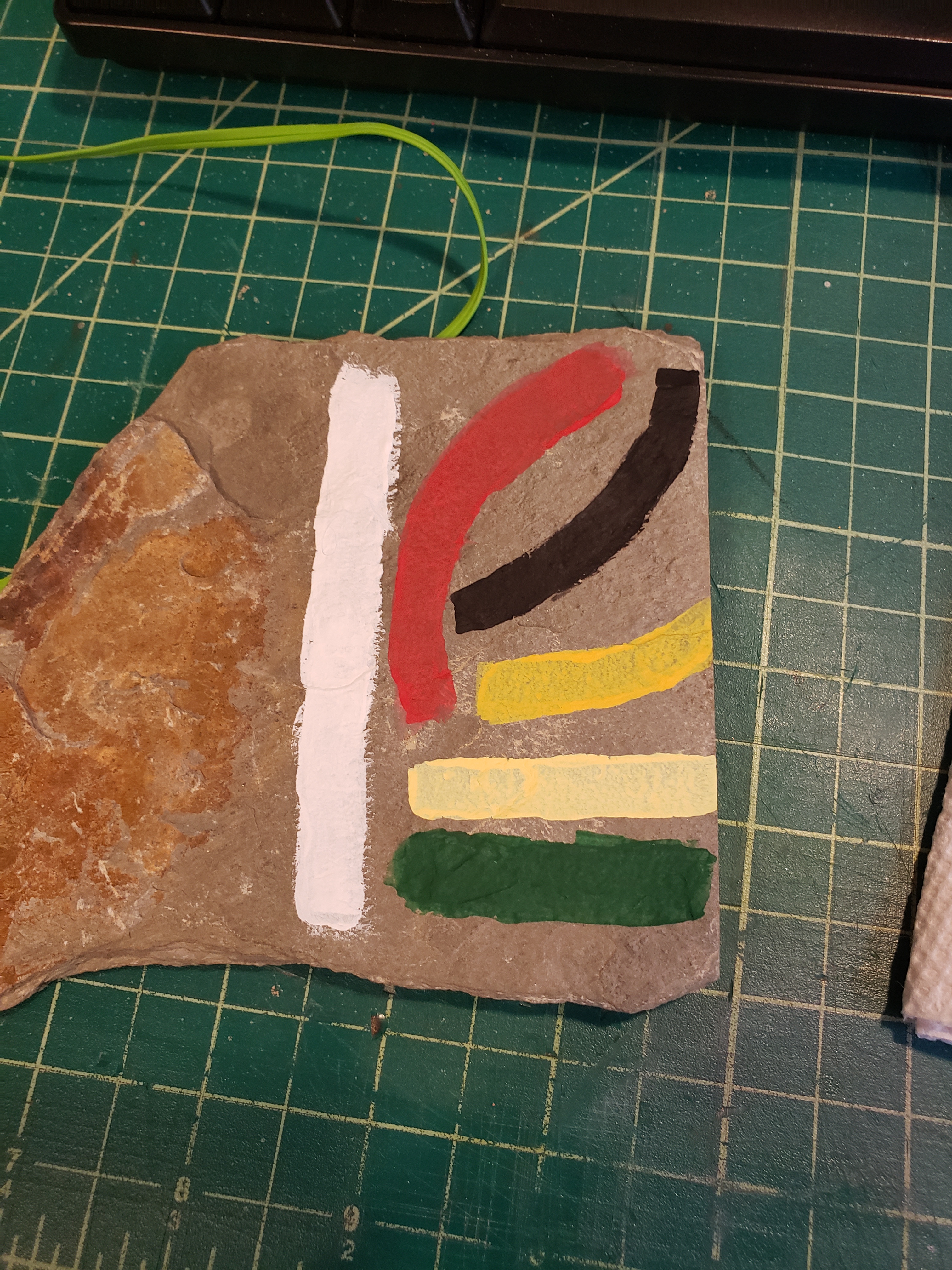
So I painted the stone white, and transferred the design using homemade carbon paper, this didn’t leave dark enough lines, so I went back over all the lines with a pencil. I then inscribed the lines on the stone using a knife. It was difficult to see which lines I had already inscribed, so I used an orange marker to keep track. Once all the lines were done, I washed the stone with soap and water. While waiting for it to dry, I tested the colors I had to see which would look best on the different lines. The colors were chosen as they are similar to colors that the original artists would have had access to, and what has been found in archaeological investigations of the stones. I transliterated the text from English characters into Younger Futhark Runes and wrote it onto the stone in two lines, since there were many more characters than would fit in one line. I cleaned up the edges with a pointed q-tip and called my courier to come and get it, as I was not going to the event this time.

I hope one day I will have time to actually carve the stone, I did a trial of it for this project but I didn’t have enough time to really do it well, so I decided to just go with the paint, but I do now know that I have the tools to actually hand carve the entire thing.
Scroll disaster averted

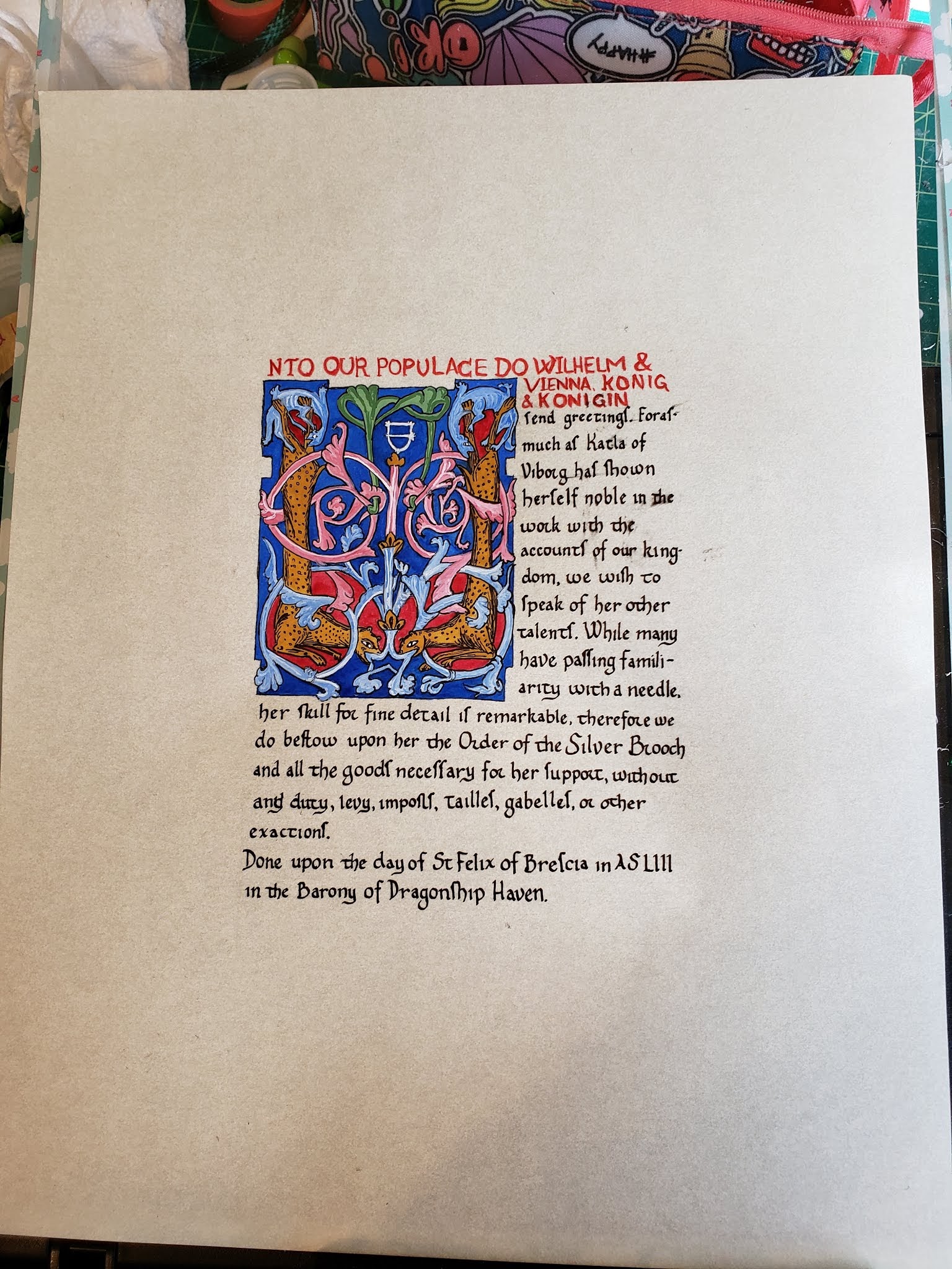
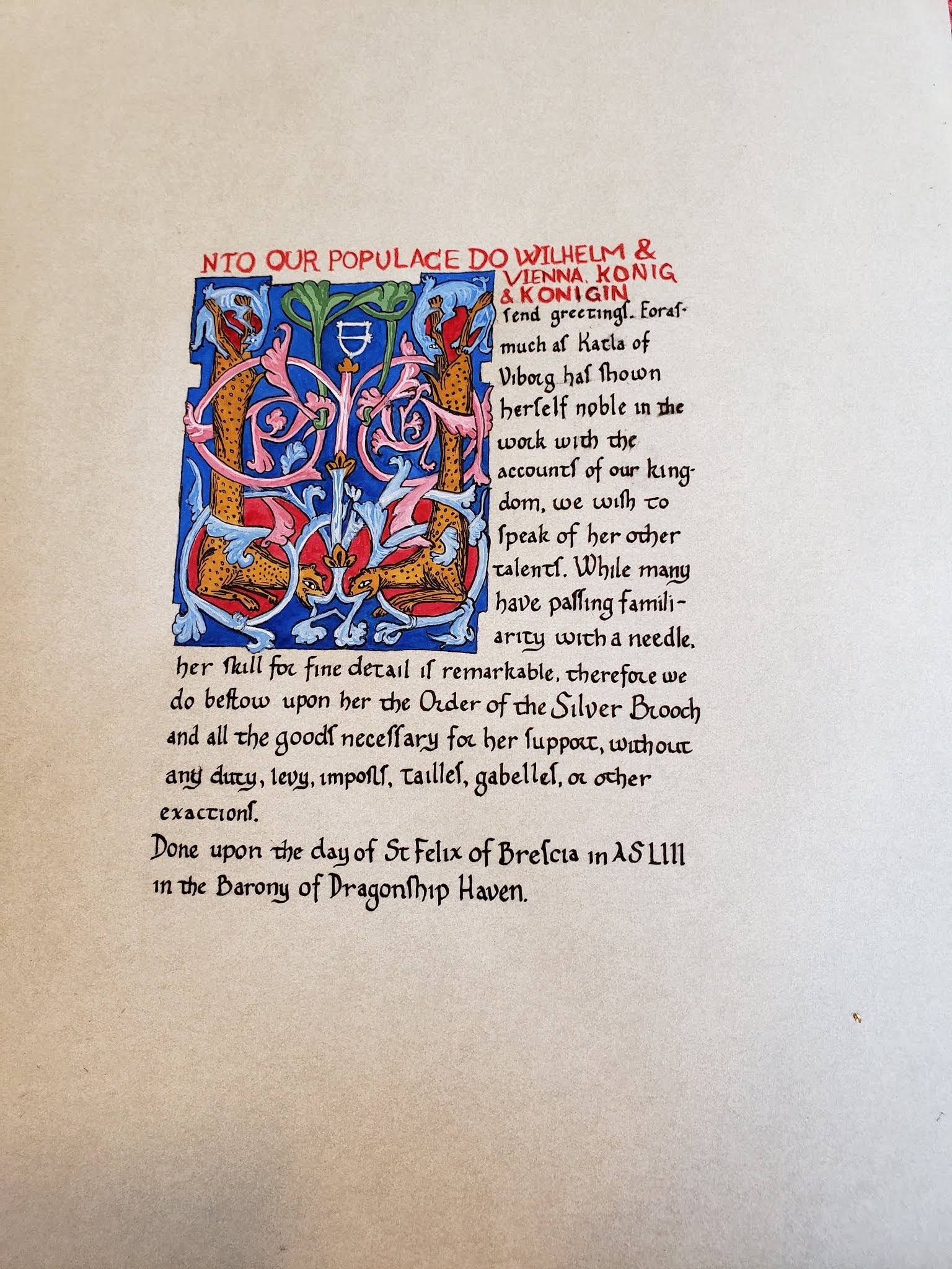
So you know how you aren’t supposed to leave things until the last minute? I’m bad at that rule. I picked this source a few months ago, I even picked the page – https://gallica.bnf.fr/ark:/12148/btv1b8530222d/f225.item Something about it just called to me and said, do this one for Katla, even though it’s not Norse, I think she’ll like it. I printed out a few pages and tucked them into my practice notebook since I haven’t done calligraphy in many months, figuring I’d need all the practice I could get. Then I failed to act on this pre-planning.

Fast forward to the weekend before it was due, I still hadn’t started and I didn’t have words. So I started emailing my wordsmith friends and they were busy, so I brainstormed and plotted and eventually gave up and asked Matthias Grunwold if he’d be up for it, thankfully he was.

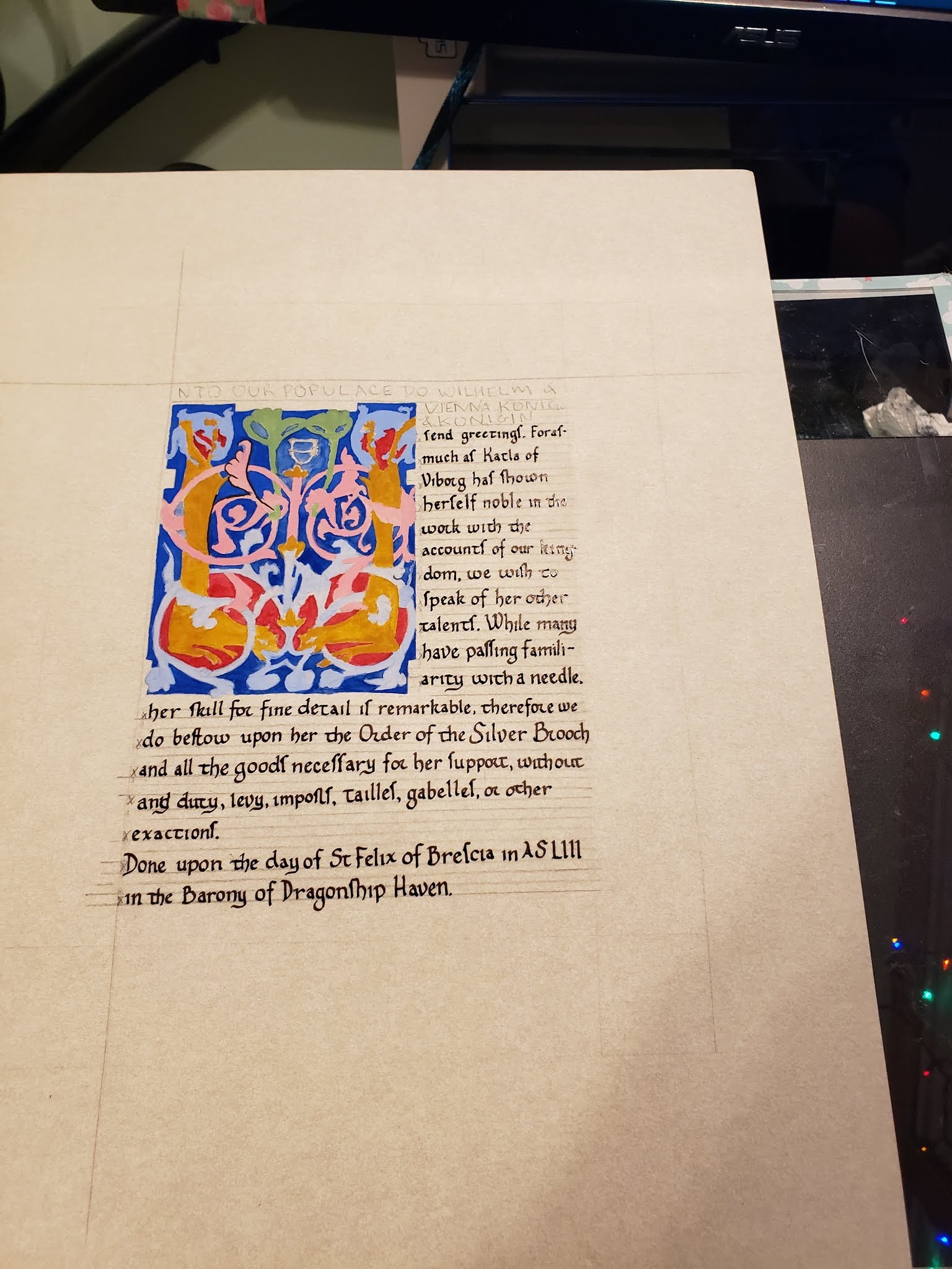
Monday night I tried to work on it but just couldn’t concentrate. Tuesday I got the layout done and penciled in all the lines. I even got a little of the painting done. Wednesday night my brain was fried, so I said no. Thursday was no better, but I got the colors blocked in. Friday I had friends coming over for dinner so I had to clean the house and cook. But after they left, I sat down and did the calligraphy with basically zero practice. It came out pretty good, I’m glad that muscle memory is a thing. Most of the errors were from me being tired. So this picture is when I called it quits at midnight on Friday, having attempted to start outlining and realizing that was a bad plan.

So I got up nice and early and went to start working on the illumination. I put my hand down on the calligraphy to steady my hand and smudged the ink that had been drying for the last 7 hours! Panic sets in, I consider scraping the whole thing, I come up with contingency plans, I text friends, I generally freaked out about this mess I made.

Then I took a deep breath and said, I know how to fix this, let’s just try to fix this and see how it goes. Worse comes to worse, I can hand in this terrible mess with an IOU since I sort of know Katla, and at least she’s local. I got out my pounce and poured it all over the page, making sure to evenly coat all the calligraphy. I let it sit for a good half hour to absorb the ink. Then I shook the pounce off the paper and took a picture – you can see where the wet ink is because those are the letters where the white pounce is sticking to the ink. (picture taken at 8:15 am)

Smudged scroll with pounce to dry the ink

I then carefully continued to work on the outlines, adding the details that make it look good, it started to take shape and the pounce fell away as it dried the ink below. Maybe all was not entirely lost – this picture is from 9:06 am, you can better see the smudge damage here since the pounce is mostly gone now.

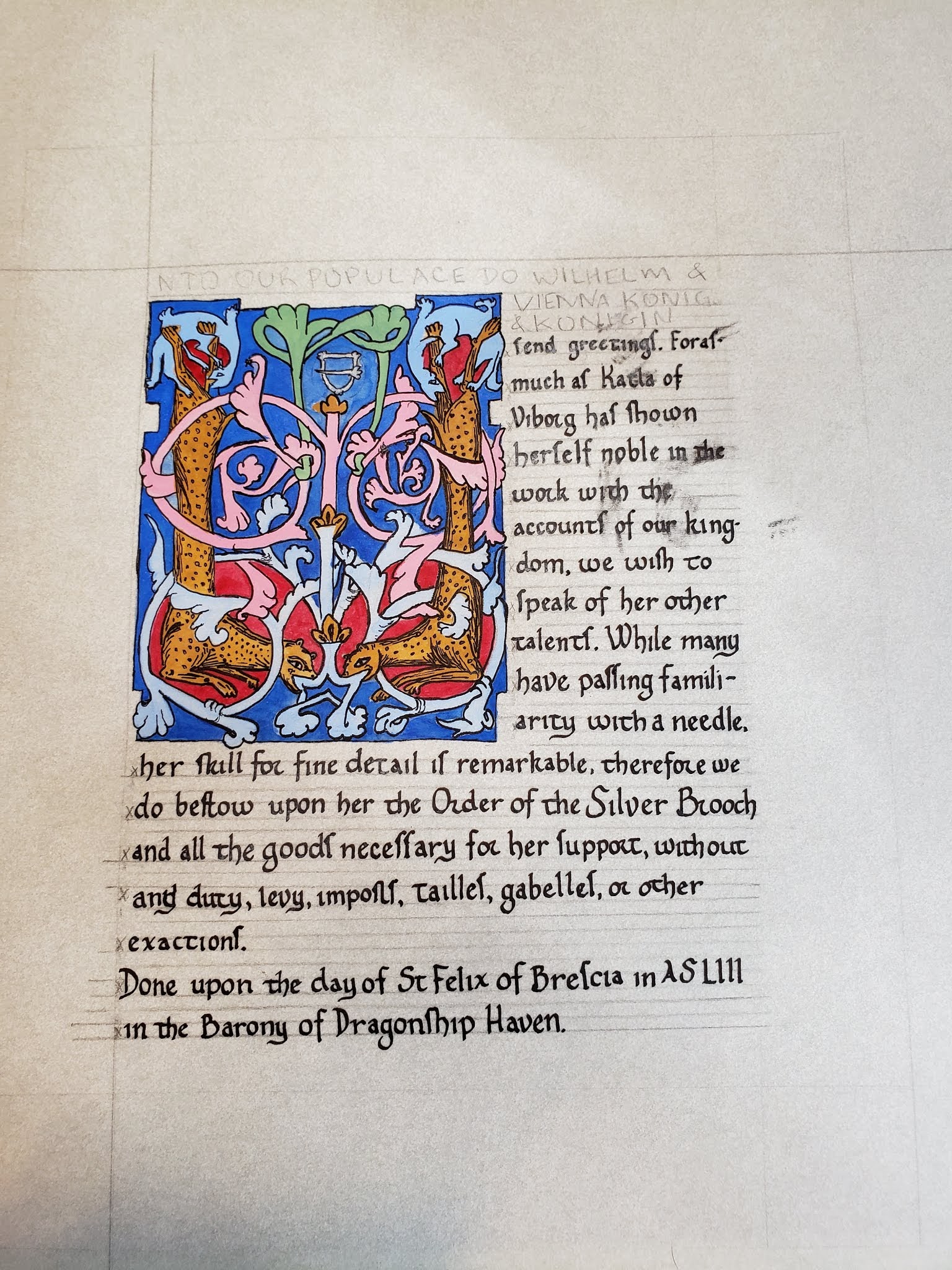
Around this point my husband who was going to the event is like, er, so I was going to leave soon, how much longer are you expecting? And I respond that I’m supposed to be leaving the house at 10 am to get to where I was going that day. I pick up the pace and start shading and highlighting like mad. Around 10:15 or so I am done painting, but now I need to do the thing I was most dreading, erasing my calligraphy guidelines. This would be the real test to see if my pounce plan had worked. I started from the outsides where there was no ink and things were ok, and then I went to the areas where the ink seemed the driest, and things were ok, though I had to go very slowly so I could stop at the first sign of any smudges. When I got up around the area where the smudges were, it wasn’t perfect, I definitely caused a few fresh tiny smudges at that point, but I got the pencil lines out for the most part. This is what it looked like post erasing, at 10:30 am –

All erased, time to try to scrape off the offending ink!

I got out my blades and started scraping. Sadly the blade I like the most (penBlade #15) has become too dull for this task, so I had to switch to one of pointy kind that always make me super nervous. But things went well. I was more conservative than I normally would have been, but at this point I had a pretty decent looking scroll and negative time to work. Here’s what it looked like when I stopped at 10:37, the the on the fourth line down could use more work, but the ink there wasn’t fully dry and so I didn’t push it. (Katla, if you want I can fix it at a later point, or you could ask one of your local scribe friends, they should be able to fix that quite easily now that it’s had some time to dry)

Post scalpel scraping. Nearly all traces of the earlier mess are gone!

So I printed off the cut sheet, packaged it up with a backing board, mat and archival bag and took one last picture before jumping in the shower to get ready to leave, I managed to only leave an hour later than planned, which considering my morning, I decided was doing quite well.

I hear that the packaging may have not gotten to the recipient, but hopefully someone ended up with that ‘scroll case’

A sister scroll to the last gothic one..

Oh Luttrell Psalter, you are so sneaky, with your pretty pretty pictures and your nice clean calligraphy – you make it all look so easy… like anyone could do that… But no, don’t be fooled, this manuscript lies to new scribes. It whispers “oh don’t worry, it’ll be fine, look at my nice crisp lines and my pretty little s’s, this won’t be hard” when really it’s a deceptively difficult manuscript to copy. Talking to various other scribes, this is a common trap that new scribes fall into, particularly ones who are more comfortable in illumination since it has such pretty pictures, but it is possible to do, particularly once you accept that yours is not going to look quite as perfect as the original.

This is the second scroll I’ve done from this manuscript in the last few weeks, and I figured the first one’s calligraphy was hard because I just hadn’t had enough time to properly learn it, so I figured the second one would go better since I had already put in so much practice time on the first. The second one did go better, but I think I need a few more years worth of practice before I can do this hand justice.

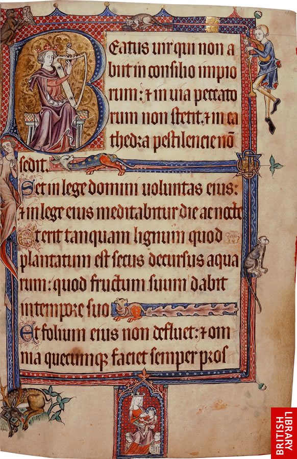
For this scroll I used folio 13 reverso (the back side of page 13) :

I chose this particular page as the person the scroll was for is a thirteenth century harper, and King David and his harp leaped to mind, plus I love this page.

page4full

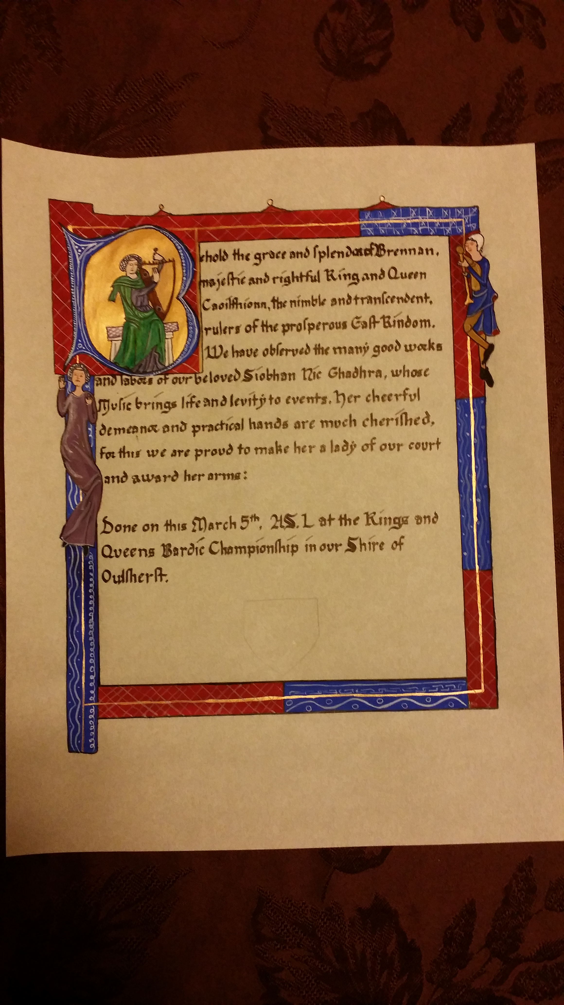
Here’s my version, a bit simplified:my_work 2016_3_4

Now look back at the previous post, that’s supposed to be the same hand – so yes, I’m making definite progress, but man is this hand hard… I’m going to set this manuscript aside for a little while and go back to my good friends in the proto-gothic world where I can actually feel a little bit of confidence.. But! My spacing and vertical lines look much better. They still need work, but way better than last time.

I try my hand at a gothic calligraphy style

IMG_20160205_110221154

Silver Wheel for A&S Champs, yes, I spelled Championship wrong… And I got carried away on my s’s – I really enjoy doing gothic short s’s now that Karen taught me a trick to them (don’t think of them as s’s, which is basically what to do with long s’s as well..)

It’s based on the Luttrell Psalter folio 53r, Here’s the whole thing online at the British library – http://www.bl.uk/manuscripts/FullDisplay.aspx?ref=Add_MS_42130 and here’s the book opened to the page I did – http://blancefleur.tumblr.com/image/84238302229

I mostly traced this one (the vines and leaves are all free hand, along with the diapering and whitework), but I’m doing a second that is entirely free hand since the images are really easy to free hand and then I can work them into the design I want more easily. I chose to trace in this particular case because I had procrastinated too long and needed to get the shapes on quickly so I’d have time to do all the layers I wanted to do.

Part of the reason I was rushed with this one was that it’s my first with metal leaf, and that took quite a bit longer than I had expected. I used Mona Lisa’s Silver Leaf from their gilding kit, which I highly DO NOT recommend. Firstly the directions are terrible, and secondly, the ‘silver’ is tin, which is fine, except that it doesn’t cut nicely so it’s really hard to brush away the extra that’s not supposed to be there as when you brush it, it rips across the part you do want. I now have plenty of the much better quality stuff to try, but I thought it might be a good idea to start with the cheaper option to see how it went, and as usual, it was miserable.

The calligraphy was all done Thursday night before it went to the event Friday afternoon, which wasn’t my original plan, but as said, the timeline got pretty compressed due to the silver, and then not realizing quite how much illumination I had bitten off until I was well into the process. (Yes, I do the illumination first, Yes, I know this is crazy, Yes, I sort of regret it for this one due to how the lines worked out, but that was also somewhat due to the compressed timeline for the calligraphy as I didn’t have time to do extensive drafts of how I wanted the calligraphy to fit into the scroll.)

It’s not terrible. Ok, it’s pretty terrible, but given how much Gothic and I do not get along, it’s pretty good. The three things I struggle with the most in scribal are 1) word spacing, 2) Verticals being vertical, 3) Getting my feets correctly on the baseline. (Yes, I’m sure there are lots of other things wrong as well, but these are the ones I’m most working on right now). So the big difference with this scroll was that I used Vertical guidelines for the first time, and it’s something.

1) Word Spacing. Within the word, and between words, it’s still not great, but this is probably the best I’ve done so far in terms of my words all being appropriate distances from each other, and the internal spacing in words is pretty decent. I think the vertical guidelines helped the most with this aspect, mostly as they created a grid that I could use to see how far the letters were from each other, and I could count on them to be regular.

2) Verticals being Vertical. This was the reason I used vertical guidelines for the first time with this scroll, and I suspect they helped, but I’m kinda amazingly oblivious to the guide lines, it’s like my hand just desperately wants to slant all my letters every which way and is revolting against the guidelines. They aren’t terrible, but being gothic it’s really obvious when they are slightly wrong. I really need to practice this ALL THE TIME.

3) Feets. Thankfully this hand has mostly flat feets, I’m especially terrible at getting pointy feets to end up in the right place.. but even with flat feets it’s really hard to remember what I am doing – mostly from a serif perspective, I really love adding little serifs, and this hand has very few serifs. But these feets were also supposed to be square, and that was very hard to do without having practiced enough. I suspect my feets would have been considerably better if I had given myself enough time to actually properly learn the hand and not been rushed.

I kinda want to animate my letters as they have definite personalities.. my Ys are so often drunkenly sliding under the table, while my V’s have too much confidence and my As are desperately trying to hold everything together but failing since their mates dislike them for thinking they are perfect.

You can also definitely see me getting more tired and sliding back into prot0-gothic, but it looks okay. ish.

Fun little AoA based on an 1100s manuscript

IMG_20151205_072240944


This AoA was for Kathryn Tighe’s son, Clark wrote the words. This is my first live scroll assignment.

The source is here:
http://gallica.bnf.fr/ark:/12148/btv1b8530185k/f11.item

I am most proud that I managed to not have to do the scroll twice as I didn’t screw it up. My goals are small. Only having to do the scroll once is a big deal 🙂

Windsor Newton cake watercolors on Fluid 100 hot press watercolor paper. Sumi green bottle ink.

I chose this source due to the information I had on the persona, I had asked around about him but my usual sources didn’t know who he was. So I picked an awesome manuscript page that had calligraphy that I liked the look of and decided to copy that. I particularly like the drawn capitals. I didn’t mean to make it yule themed (red and green) and didn’t pick up on that until the day of the Yule event. But regardless, it was how the original was done and I really like the simplistic design.

Takeaway – I need to make myself use vertical guidelines, even if it doesn’t seem worth it, it totally is.